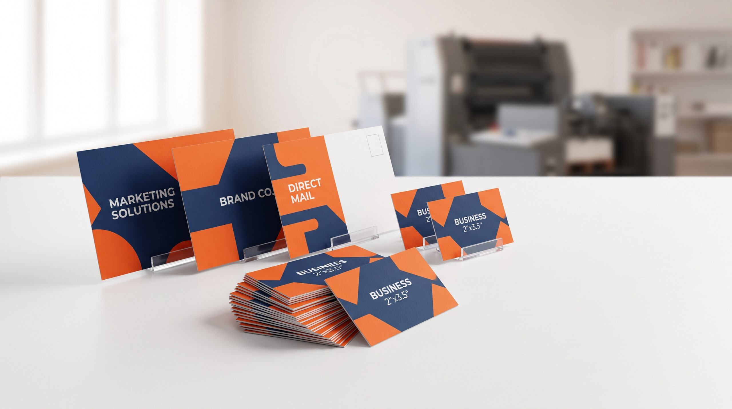
When you send a postcard to a prospective client in Irvine, the goal is to get them to call, visit, or remember you. If that postcard doesn’t match your business card, you are working against yourself. A mismatch in logo color, font style, or paper stock makes your brand look fragmented and less credible. The solution is to plan your print collateral as a single system, not as separate items. This guide covers how to align your postcards and business cards for direct mail campaigns, specifically using the services available at Avanti Printing in Irvine (15321 Barranca Pkwy), and how to avoid the common pitfalls that cost businesses time and money.
Why Your Postcard and Business Card Must Match
Direct mail works on recognition. If a recipient receives a postcard with a bold, modern sans-serif font and then later receives a business card with a serif font and a different shade of blue, they will not connect the two. That disconnect wastes the money you spent on the mailer. The brain registers the inconsistency as a red flag, making your business look unorganized.
Consistency builds a “mental shortcut” for your brand. When the postcard and business card look like they belong to the same family, the recipient subconsciously assumes your company is established and detail-oriented. This is particularly important in a competitive market like Irvine, where decision-makers are bombarded with marketing daily. A matched set cuts through the noise because it looks professional before a single word is read.
The “Same Family” Rule
You don’t need the pieces to be identical. They need to share three core traits: the primary logo, the primary color, and the primary typeface. If your business card uses a specific dark green, the postcard should use that exact same green in the header or footer. If your card has a distinctive rounded corner, consider a similar finish on the postcard. This visual repetition is what triggers brand recall.
Key Elements to Align Between Postcards and Business Cards
Before you send a file to the printer, sit down with both designs side by side. Here are the specific elements that need to be locked down to ensure a cohesive look.
- Logo placement and size: The logo should occupy a similar percentage of the canvas on both pieces. A tiny logo on a 5×7 postcard and a huge logo on a business card looks sloppy.
- Color values (CMYK): Do not use “eyeball” matching. Use the exact CMYK or Pantone values from your business card file on the postcard file. A 10% difference in ink density is visible.
- Font hierarchy: Use the same font for your name on the card and the headline on the postcard. Use the same secondary font for body text on both.
- Paper finish: A high-gloss card with a matte postcard will feel disconnected. Choose a consistent finish (matte, gloss, or soft-touch) for both.
- Contact info format: If your phone number is formatted as (949) 555-1234 on the card, use the same format on the postcard. Don’t switch to 949.555.1234.
Local Logistics: Printing and Mailing in Irvine
Working with a local printer like Avanti Printing in Irvine (15321 Barranca Pkwy offers a specific advantage: you can physically hold the business card and the postcard proof next to each other before the full run. This is critical. On a screen, colors look different than they do on paper. Being able to say, “That blue is too dark on the postcard,” while holding the card in your hand prevents a costly mistake.
Local printing also simplifies the mailing process. You can have the postcards printed and then work with the same team to handle the mailing logistics, often including USPS bulk mail preparation. This saves you from the headache of coordinating with a separate fulfillment center. For a city like Irvine, where zip codes range from 92602 to 92620, a local printer can help you target specific neighborhoods without paying for unnecessary mailing zones.
Why USPS Regulations Affect Your Design
If you are mailing a postcard, you must leave a specific area on the right side for the address and postage. This is called the “OCR” (Optical Character Recognition) clear zone. If your design bleeds into this space, the postal service may reject the mailer or charge you a surcharge. When you design your postcard to match your business card, you must account for this blank space. It changes the layout. A good printer will warn you about this before you finalize the artwork.
Design Strategy: Direct Mail vs. Networking
A business card is a hand-to-hand tool. It is meant to be held, read closely, and filed away. A postcard is a glanceable tool. It has about three seconds to convey a message before it hits the recycling bin. This difference in function means the design, while matching in brand, must differ in layout.
On the business card, you have room for a tagline, a QR code, and maybe a list of services. On the postcard, you need one strong headline, one image, and one call to action. The common mistake is cramming the business card text onto the postcard. Instead, use the postcard to highlight a single offer, such as a free consultation or a discount on the first order, and use the business card as the “proof” of who you are.
Information Hierarchy
Decide what the primary action is. If the postcard is meant to drive traffic to a website, the URL should be the largest text element after the headline. If it is meant to generate phone calls, the phone number should be in a bold, contrasting color. Your business card should carry the same primary action as a secondary element, ensuring that no matter which piece the recipient holds, they know how to reach you.
Cost Factors: What Affects the Price of a Matched Set
Budget is always a concern. When you order matching postcards and business cards, you are not just paying for paper and ink. You are paying for setup time, color calibration, and finishing. Here are the cost drivers to be aware of.
- Paper weight: A 14pt card stock for business cards is standard. For postcards, you need at least 12pt to withstand mailing. Matching the finish on two different weights can sometimes require a special order.
- Quantity tiers: Printing 500 business cards and 1,000 postcards is often cheaper per unit than printing 250 of each. The setup cost is amortized over the run.
- Finishing options: Spot UV (a glossy coating on a matte card) or rounded corners add cost. If you use these on your business card, you must decide if the postcard gets the same treatment. Often, you can skip the spot UV on the postcard to save money, as long as the base stock matches.
- Mailing services: If the printer handles the mailing list, sorting, and postage, there is a service fee. This is usually worth it because they handle the USPS paperwork, which is complex.
Common Mistakes to Avoid in Direct Mail Branding
Even with a good design, small errors can derail your campaign. Here are the most frequent issues seen in print jobs, and how to avoid them.
- Using RGB colors: Screens use RGB. Printers use CMYK. If you send an RGB file, the printer converts it, and the colors will look washed out or different from your business card. Always convert to CMYK in your design software.
- Forgetting the bleed: A postcard printed edge-to-edge needs a 1/8″ bleed on all sides. If you don’t include it, the printer will either reject the file or you will get a white border where you didn’t want one.
- Low-resolution images: An image that looks fine on your computer monitor at 72 DPI will look pixelated in print. All images must be at least 300 DPI at the final printed size.
- Ignoring the “grain” of the paper: Paper has a grain direction. If your postcard is folded, the fold must run parallel to the grain to avoid cracking. A local printer can advise on this; an online printer cannot.
Step-by-Step: How to Order Your Matched Set
Here is the workflow to get a consistent result, whether you are a new business or refreshing your brand.
- Audit your current brand: Write down your exact color hex codes, your font names, and your logo file paths. You will need these for the new files.
- Design the business card first: This is your “source of truth.” Once you approve the card, use it as the template for the postcard.
- Create the postcard layout: Use the same header and footer. Add the mailing clear zone. Keep the body copy short.
- Request a physical proof: Do not approve a PDF proof alone. Ask to see a printed proof. At Avanti Printing in Irvine (15321 Barranca Pkwy, you can request a hard copy proof to check the color match against your existing card.
- Approve and schedule: Confirm the turnaround time. Ask if the mailing service is included or if you need to schedule that separately.
What to Check on the Proof
When you get the proof, do not just look at the images. Check the spelling of the address. Check the zip code. Verify that the phone number and website are correct. Most importantly, place the proof next to your business card. If the whites of the paper look different (one is bright white, the other is cream), the match is off. If the logo color is off, reject the proof and ask for a re-calibration.
Frequently Asked Questions
Q: Can I use a design from an online template for both my postcard and business card?
Yes, but be careful. Many templates are not set up for the USPS clear zone requirements for mailing. You will likely need to adjust the layout. A local printer can help you modify the template to meet postal regulations.
Q: How many postcards should I order for a local Irvine campaign?
It depends on your target area. A single zip code like 92604 has roughly 15,000 households. You can start with 2,500 to 5,000 pieces to test a specific neighborhood or demographic. It is better to do two small, targeted mailings than one large, generic one.
Q: Is it cheaper to print postcards and business cards together?
Often, yes. If you print them in the same production run, you save on setup fees and paper waste. Ask the printer for a combined quote. They can often offer a discount because the color calibration is done once for both jobs.
For a free estimate on a matched set of postcards and business cards, check the services offered by Business Cards Irvine to see how they handle combined print runs and local pickup. Getting the design right is half the battle; the other half is trusting a printer that understands the local mailing rules and paper stock. Take the time to align your print collateral, and your direct mail response rate will reflect the effort.
Visit Business Cards Irvine