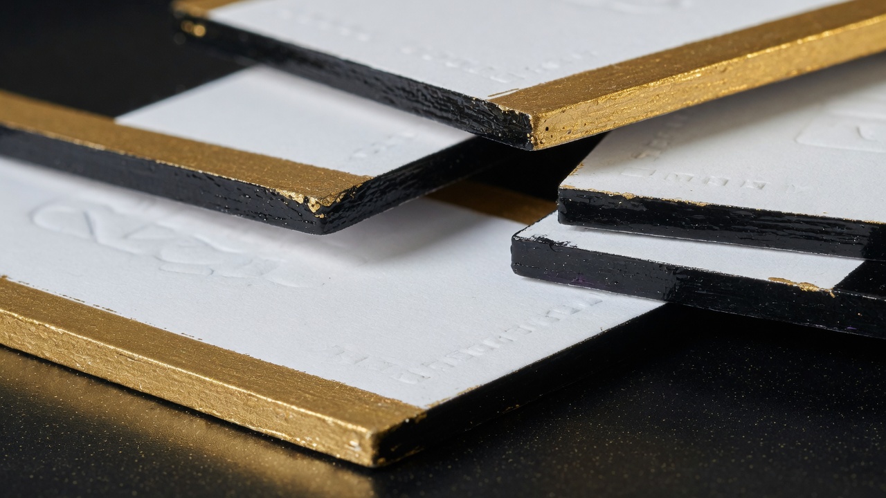
Painted edge business cards get color on the cut after the deck is trimmed. Colored-core duplex shows mill color in the sandwich the moment you cut. Paint can chip, block, and needs dry time. A dyed ply does not flake like paint. Dark coated stocks flash a white halo unless you paint, duplex a colored core, or print on through-color board.
That is the whole edge decision, stated without a product poem. The rest of this page is how a roller on a clamped deck differs from a colored ply, why a navy flood on 16pt C2S still looks unfinished from the side, what Orange County heat and wallets do to wet paint, and what I need on a quote so we are not matching a PMS with a Sharpie. I estimate this work at Avanti Printing, 15321 Barranca Pkwy, Irvine, CA 92618. If you want to fan a painted deck next to a split duplex, call (949) 387-0787 and come in. Fingers beat a render of a gold rim. Quotes still confirm size, material, quantity, finish, and date. “Pretty edges” is not those five facts.
People search painted edge business cards after a mockup showed a colored rim that the PDF never specified, after a white core showed on a black card in a Spectrum courtyard, or after a box arrived with cards stuck together at the edge. Those are three different failures: a file that pretended to be bindery, a stock that was white all the way through, and paint that was boxed before it was dry. Edge color is a physical operation. It is not a stroke in Illustrator.
Edge paint versus a colored core, side by side
Start with the object, or you will argue with a quote that was never wrong. Shops use “colored edges,” “painted cores,” “duplex color,” and “edge painting” as if they were one SKU. They are not. On a card quote in this plant, the words mean this:
- Edge painting is color applied to the cut of a finished deck. Print, coat or film if specified, trim, clamp, paint the four sides, dry, fan the cards apart so they do not weld, dry again, then box. The face of the card can be any stock. The rim is a coating on fiber ends — and, on laminated cards, on a hair of film.
- Colored-core duplex is a sandwich. Two printed (or printable) faces with a colored ply in the middle, or two through-color sheets glued back to back. The color you see on the edge is paper. You reveal it with a blade. You do not paint it on afterwards, unless you also want paint, which is a second, usually pointless, line.
- Through-color board is a mill sheet dyed in the fiber. There is no sandwich. Cut it and the edge is the sheet. Black, navy, kraft, and a handful of mill reds and greys live here. The palette is the mill’s, not a mixing cup.
Paint is a coating on a cut. A colored core is paper you cut into. Through-color is paper that was never white. If an email says “colored edges,” I will write back and ask which object. A mood board with a gold rim is not a spec.
Use this table as a counter conversation, not a lab report. Caliper bands are typical mill and shop ranges. Finished height still moves if you add film.
| Spec | Edge paint on white-core stock | Colored-core duplex | Through-color mill sheet |
|---|---|---|---|
| Where the color lives | On the cut, after trim | In a ply (or two) you cut through | In the fiber of the whole sheet |
| Color range | Wide: mixed to a target, including contrast rims | Mill and ply colors; two-tone edges if the faces differ | Whatever the mill stocks; not a custom mix |
| White halo on a dark face | Hidden if the paint is opaque and intact | Hidden if the core is dark; glue line may still show | None, if the sheet is truly through-color |
| Chip / flake | Real risk at corners and on film | Fiber, not a paint film; corners crush before they flake | Fiber; scuffs as paper scuffs |
| Dry / cure time | Hours between coats; do not box wet | Adhesive nip and cure, then trim; no paint clock | Print and coat clocks only |
| Best default job | White or cream 16pt/32pt that needs a rim color you cannot buy as paper | A thick object whose edge is part of the architecture | Paper-forward dark cards, writing backs, brands that want fiber not a painted line |
| What the PDF controls | Nothing about the rim. Specify the color in the quote. | Faces only. Core color is a material line. | Faces. Expect the edge to match the sheet, not a PMS on the print. |
Do not shop these as “more premium” in a straight line. Paint on 14pt is a thin ribbon you barely see. Duplex 32pt with a black core is a small object. Through-color 16pt uncoated is stationery with an honest edge. The job picks the object. Instagram picks a rim and then gets angry at chemistry.
If you already know you want the rim as a design color you cannot buy as board — a specific red, a yellow that has to talk to a logo, a navy that is not the mill navy — you are in paint. If you want thickness and a dark cut that will still look like paper in five years, you are in duplex or through-color. If you want both a custom rim and a 32pt thud, you can paint a duplex card. That is two lines. I will price two lines.
Get pricing for painted-edge or colored-core cards
Who this edge choice is for in Irvine and Orange County
This write-up is for the person who approves the spec and then has to live with the stack in a wallet, a badge sleeve, or a listing kit. Founders in Irvine Company suites, brokers working Spectrum opens and Newport showings, clinic directors on Barranca and Alton who want a quieter object than the staff card, attorneys and architects who still put a card on a walnut table, hospitality managers in the Spectrum and Woodbridge, interior designers, high-end contractors who leave a card in a bid kit. You are buying a third surface — the 0.016 to 0.032 inch of board you see when the card is on a desk — for Orange County rooms, not a gold stroke in a PDF.
Staff cards for a whole floor usually do not need a painted rim. The rim is a principal move, a luxury listing move, a design-consult move. If you force every coordinator onto edge paint because the owner liked a sample, you are buying dry time and chip risk for people who will live in a badge reel. Owner cards and staff cards can share a layout and split the edge. That is a normal two-line quote on premium business cards with painted edges or colored cores.
I split the jobs because the edge should follow the job:
- Hide a white core. Dark full-bleed faces on ordinary C2S. The handshake looks finished from the front and cheap from the side. Paint the rim dark, or duplex a dark core, or change the sheet. Do not “fix” it with a keyline in the file.
- A contrast rim as the design. Cream stock, navy paint. Black stock, a mixed red. White 32pt, a yellow that matches a mark. This is paint territory. Mills will not custom-dye a ply for 500 cards.
- A thick object whose cut is architecture. Duplex, often 32pt, often with a black or kraft core. The edge is strata. Some buyers like seeing the glue line. Some want it painted over. Say which.
- Paper-forward dark cards. Through-color uncoated. Architects who sketch, some wine and interiors people, anyone who wants the edge to be fiber. The palette is limited. The chip conversation mostly goes away.
- Daily mixer cards that must survive a tote. Often no paint. Silk film or aqueous on 16pt, white core accepted, or a dark through-color if the brand is already paper. Paint on a card that lives with keys is how you own a chip pattern by week three.
If the layout is still moving, do not order a custom mixed rim on 1,000 duplex cards. Edge color is a poor place to trap budget that a title change will strand. A short painted run for frozen names, and a plain 16pt run for everyone else, is the Irvine office pattern I will defend in writing.
Daily-carry work without a rim still runs through standard business card printing in Irvine. This page is the third-surface conversation. Do not bury a painted deck inside a “usual cards, soon” email.

How painted edges actually get onto a deck
The press does not paint edges. Bindery does. If you skip this sequence in your head, you will not understand dry time, and you will not understand chipping.
- Print the faces. 3.5 × 2 trim, bleed, the usual file. Dark floods need to be dry before film, if film is in the spec. That is already a clock. Edge paint is a later clock.
- Coat or laminate if specified. Aqueous, UV flood, silk film, soft-touch — those are face finishes. They change how paint grabs the corner where face meets edge. Film is the fussy one. Paint sticks to fiber ends more kindly than to polypropylene.
- Trim into cards. Guillotine, then round if you asked for a radius. Paint after the final outline. Painting a rectangle and then rounding it shears the paint off the corner and leaves a white nick. Round first, then paint, or die the shape and then paint. Put the radius on the quote with the rim.
- Jog and clamp a deck. Cards have to be a solid brick. Air in the stack is how paint creeps onto the face as a halo, which is the other halo, and it is a defect. Too tight and you starve the cut of paint. This is a hand skill, not a checkbox.
- Apply paint to the four sides. Roller, pad, or brush, in thin coats. One heavy coat looks opaque in the first minute and then chips like dried gravy. Two or three thin coats, with dry time between them, is how you get a rim that is still there in June. Metallic mixes and very light pastels often need an extra pass to cover a white core.
- Dry the brick, then fan the cards. If you skip the fan, you have a painted brick, not a deck of cards. If you fan too soon, you pull threads of paint and stamp wet color onto the faces. If you fan and then box while the rims are still tacky, the cards block — they glue themselves together at the edge, and peeling them takes the paint off.
That last sentence is the Orange County summer problem in a closed carton. Inland Irvine heat speeds dry air, which helps the water leave, and it also turns a slightly tacky rim into adhesive if the box is closed and the pack is under its own weight. Coastal humidity in Newport and Laguna slows the water. Neither climate is an excuse to skip the fan. Both are a reason the date on the quote has to include this operation, not only press time.
What I will not pretend: there is no universal hour-count I can print here that certificates your box. Typical shop practice is multiple thin coats with hours between them, then an overnight or longer before the deck is handled as a product. Dark, highly pigmented mixes and some metallics can sit longer. A rush request that treats paint as a same-slot add-on as aqueous flood is how you buy blocking. I will not invent a clock to fill a blank. Give me the date you need them in a hand. I will tell you whether the chemistry fits.
Sanding the cut before paint is a real step on some decks, especially duplex with a proud glue line or a fuzzy board edge. Light abrasion gives tooth. Heavy sanding rounds the arris and makes the face look beveled, which some luxury work wants and some legal offices will hate. If you want a sharp painted arris, say sharp. If you want a softened, almost painted-bevel read, say that. Do not assume the sample you saw on a phone is the default.
Quantity changes the brick. A 100-card painted job is a small clamp and a lot of handling per card. A 1,000-card painted job is several bricks, more chances for the last brick to be boxed impatiently, and a better amortizing of the setup. I would rather you order a quantity you will use than a vanity 2,000 that sits in a closet while the paint waits to get scuffed in a drawer. Quantity is a different conversation. Edge paint still cares how many bricks we have to dry.
Rounded corners: the radius is a shorter, curved cut. Paint wants to skip the high point of the curve or pool in the hollow. A 1/8 inch radius is paintable with care. A 1/4 inch radius is a bigger curve and a bigger chance of a thin spot. Duplex 32pt with a 1/4 radius and a metallic mix is a specialty brick, not a checkbox. Mention all three on the same line if that is the object you want.
How colored-core duplex is built — and when through-color is enough
Most “colored core” cards in this market are not a magician dyeing the middle of a 16pt sheet. They are a sandwich.
- Print the two faces on two sheets, unless you are using a mill duplex board the press can feed as one thick sheet. Confirm feeding. Do not assume a digital engine wants 32pt plus a colored interior.
- Nip with adhesive, sometimes with a third ply whose only job is color. Two 16pt whites with a black sheet in the middle is a common luxury build. Two through-color sheets back to back — navy on navy, kraft on kraft, black on cream — is a two-tone edge. The cut shows both colors as strata.
- Cure the adhesive. This is the duplex clock, not the paint clock. Trim too soon and the corner lifts later in a gym bag. That is a production defect, not “how duplex is.”
- Trim. The core appears. If the faces are white-core C2S and the middle is black, you get a dark line between two light plies — a framed core. If both faces are through-color black, the whole cut is black. If one face is white and one is black, the edge is split: half and half. Say which picture you want. A phone photo of “black edge cards” could be any of those three.
North American labs measure single-sheet thickness with methods such as TAPPI T 411, a specified presser foot and pressure. Duplex is not a single mill sheet in most of the jobs I quote. The micrometer reads the sandwich. Film on the outer faces adds mils. If you need the credit-card thud, write the finished caliper you want, or write “32pt duplex” and ask whether that number is raw board, glued board, or board-plus-film. Edge color is a separate line. A black core does not make the card thicker. It makes the cut dark.
Glue lines: a careful eye sees a hair of adhesive on a duplex cut. Some architects like it — it reads as a made object. Some brand managers hate it and ask us to paint over the sandwich so the rim is one color. Painting a duplex edge is allowed. It adds the paint clock and the chip clock on top of the adhesive clock. If the only reason you wanted duplex was a black cut, a black through-color 16pt sheet may be enough, and you skip the sandwich. If the reason was stiffness plus a black cut, keep the sandwich and decide whether the glue line is a feature.
Through-color uncoated is the quieter cousin. The mill dyed the fiber. You print on it — often with opaque white if you need light type on black or navy — and the edge is already the sheet. No paint. No third ply. Limited colors. Scuff is paper scuff. A ballpoint will write on many of these sheets. That is why I spec through-color for paper-forward brands that also need a dark edge, and why I do not spec it when the buyer’s color is a mixed yellow that does not exist as a mill cover.
What duplex will not do:
- Give you a fluorescent rim. Mills do not stock that as a core for business-card work in the way a mixing cup does.
- Hide a bad layout. A 32pt black-core card with 8-point gray type is a thick, dark mistake.
- Fit every phone-case slot. Height is still height. Test the wallet. A black core does not shrink a 32pt sandwich so it can live in a MagSafe slot.
- Replace face finish. A kraft core with gloss film on the outside is a different object from kraft uncoated. Name both.
Mill duplex board that arrives already bonded is a feeding and availability conversation. If we have it, and the press will take it, the glue-line question changes. If we are building the sandwich here, we control the core color from the sheets we can buy. Either way, the core is a material, not a PMS swatch I can remix on Thursday because marketing changed the deck from forest to wine.
Two stocks on one order is allowed. Principals on 32pt black-core duplex, staff on 16pt C2S with no rim, same lockup, is a common Irvine pattern. Keep the face file identical. Change the material line. Do not redesign the mark to “use the edge” on one seat and not the other unless you want two brands at the same mixer.
Dark stocks, white cores, and the halo you cannot unsee
This is the conversation that creates half the painted-edge orders in this building, and it is usually not the conversation the buyer thought they were having. They designed a navy or black full bleed. They approved a PDF that looked like a tile. They held the box and saw a white ring.
Ordinary 14pt and 16pt C2S cover is white fiber with a clay coat. You can print 300% ink on it. You can film it. The cut is still white. In a handshake, the other person sees a dark face and a light rim. In a stack on a walnut table, they see a white brick with dark ends. Some people like that, the way a paperback shows a white cut. Most people who paid for a black card did not like it. They thought the paper was black. It was not. The ink was.
Fixes, in order of how I actually write them:
- Accept the white cut. Fine on light faces. Fine if the brand is “ink on paper” and you are not pretending the sheet is a black object. Not fine if the whole point of the card was a black object.
- Paint the rim to match the face, or to contrast it. Matching navy on a navy flood is the hide-the-halo move. Contrast — black face, red rim — is a design move. Both are paint. Matching is harder than it sounds, because process ink on a coat and mixed paint on fiber ends are not the same color engine. Close is the honest word. Identical is a fight.
- Duplex a dark core. The cut becomes a dark line or a dark field, depending on ply. Glue line may show. No paint chip. Mill color, not a custom mix.
- Print on through-color dark board. The sheet is the color. Type that needs to be light needs opaque white, or you reverse out of the sheet and live with the mill shade as the “white.” This is a file and ink conversation. It is also the cleanest dark edge that is still paper.
Soft-touch navy with a white cut is a special disappointment. The face says velvet object. The side says office-supply core. If you love velvet and you love navy, budget a rim or change the sheet. I have watched people try to color a white cut with a marker at a mixer. That is not a production method. That is a cry for help.
Uncoated cream with a dark flood has a milder halo because the sheet is not a hard white clay. It is still a halo. Paint on uncoated edges can wick a hair into the face if the clamp is poor — a fuzzy dark stain along the arris. Film on the face stops that wick but gives you the film-adhesion problem at the corner. There is always a trade. Name it.
Light faces with dark rims are the other dark-stock cousin: the card is not dark; the cut is. Cream 32pt, black paint. White 16pt, forest paint. This is fashion, and it is legitimate fashion, and it shows every nick in the paint because you have maximum contrast on a thin surface. If you want that look, you also want to hear the chip section. A dark rim on a light card is a pinstripe. Pinstripes advertise damage.
Printing on actual black or navy through-color: your PDF’s “paper white” is not paper white. Unprinted areas are mill color. If the layout depends on a white field, you are either printing white ink or you picked the wrong sheet. Opaque white is a pass, sometimes two, and it is never as innocent as unprinted C2S. If the brand needs a bright white panel and a black edge, you want white-core stock plus paint or a white face ply over a black core — not a black mill sheet with a prayer. That is a design conversation. If the file still needs to be rebuilt around the sheet, say you need custom business card design that follows the stock and the edge instead of forcing a C2S layout onto black board.
Photographs on dark sheets, metallic inks, and extra decorative passes on the face are a different finishing conversation. They do not replace an edge spec. Get the cut right first. A decorated face with a white halo is still a white halo.
Chipping, blocking, and what pockets do to paint
Paint on a card edge is a thin film on the ends of fibers, wrapping a sharp arris, sometimes sitting on plastic film at the face. It is not automotive clearcoat. It will not survive the same abuse. If you need that said twice, here it is: painted rims scuff. The question is whether they scuff in a way you can live with.
Where paint fails, in the order I see it:
- The corner arris. Square-cut corners take the first hit in a wallet, a badge reel, a metal clip. Paint there is a little ridge. It shears. Rounded corners move the hit onto a curve; they do not make paint immortal.
- The face-to-edge seam on film. OPP silk or soft-touch is polypropylene. Edge paint is usually a water-based or specialty acrylic mix in this kind of work — a typical chemistry family, not a formula I will pretend is secret or universal. Adhesion to plastic is the weak joint. A thumbnail at that seam lifts a crescent of color and flashes white core or white film. Labs rate coating adhesion with tape methods such as ASTM D3359. I am not certificating your 500 cards to a cross-hatch tape test. I am telling you why a suede film and a brittle thick coat are a bad marriage.
- Keys, coins, badge clips. Abrasion. The rim burnishes, then breaks. Silk film faces survive the tote; the painted rim may not. Through-color and colored cores shrug. Paint does not.
- Fanning a pack that was boxed tacky. Blocking. The cards glue at the rim. You peel them and you peel the job. This is a dry-time failure, not “cheap paint.” Do not store the carton in a parked car on Barranca while you “let them finish drying.” They will finish welding.
- One thick coat. Looks rich on day one. Shrinks, crazes, sheds. Thin coats. Dry between them. This is not optional craft wisdom. It is how films work.
- Very light and metallic mixes on a dark or white core that needed more coverage. Extra passes, or a ground coat, or accept a slightly translucent rim. Hammering one wet pass until it hides is how you make a chip magnet.
Pockets in this county are not gentle. MagSafe wallets, phone-case slots, slim bifolds in Irvine Company towers, badge reels at clinics, cup holders between Tustin job sites. A painted 32pt card that cannot enter the slot will live in the cup holder, which is grit, heat, and bounce. The rim will tell on you. If the card must live in a slim slot, reconsider paint, or reconsider height, or both. A through-color 16pt dark card in that slot will look like itself longer.
Soft-touch plus paint is the combination people order from a photo and regret in a pocket. The nap burnishes on the face. The rim chips at the film seam. The navy flood shows thumbs. If the card is a desk object for a listing appointment — sits on a kitchen island, goes back into a folder — velvet plus a painted rim can be the right theater. If the card is daily carry with keys, I will push you to silk film and no paint, or through-color, or a colored core with no paint. Desk versus pocket is the whole argument. It is the same argument as finish, now applied to a fourth millimeter of the object.
Uncoated plus paint: the paint can grab fiber well and still dust off as paper dust if the board is bulky and the cut is fuzzy. A clean guillotine cut matters. A hard, dense cotton or a smooth uncoated will take paint more cleanly than a cheap bulky recycled sheet. If you are on a recycled uncoated for other reasons, say so. I would rather show you a sample cut than promise a hard enameled rim on a fuzzy board.
What “chip resistance” talk on a product page usually means: the shop used thin coats, let them dry, and photographed the card on day one. Ask how the sample was carried. Ask to fan the sample. Ask to drop it in your actual wallet for a week if this is a 1,000-card decision. A week is cheaper than a thousand rims.
Request an edge-color and duplex quote
Matching the rim to a brand color — and what the PDF cannot do
Edge paint is mixed. I can aim at a Pantone number, a printed face, or a physical swatch you walk in. “Aim” is the honest verb. Process ink on a coated face, viewed under Irvine courtyard sun, is not the same colorimetric event as a paint film on fiber ends, viewed at 90 degrees, in the same sun. If your brand police need a spectro match between the navy flood and the navy rim, you are asking two chemistries to impersonate each other. We can get close. We cannot promise a contract proof on a surface that is a millimeter tall.
What I want in the quote for a mixed rim:
- A Pantone number (coated or uncoated, say which), or
- A printed sample of the face we are matching, on the actual stock if you have it, or
- A physical object — a thread, a tile, a current card — not a screenshot.
What I do not want: “the gold in the logo.” Which gold. The logo is likely CMYK or a spot on the face, and may not even be a true metallic. Metallic edge paint is still paint with mica or bronze powder or a similar effect pigment. It is not a stamped metal leaf. If you want a warm metallic rim, say warm metallic and come look at the jar. If you want the rim to match a specific PMS yellow, say the number and accept that metallics and fluorescents are their own trouble.
Contrast rims should be chosen as contrast, not as a failed match. Cream plus navy is a decision. Black plus a mixed red is a decision. Black plus “whatever navy you have” is how you get a rim that looks almost like the face and therefore looks wrong. Either match close, or jump far. The in-between is mud.
Colored cores do not mix. You pick a mill sheet. Black, a kraft, a mill navy, maybe a red if we can buy it in the ply you need. If the core has to be a custom orange, you are back in paint, or you are in a special mill order that does not belong on a 250-card job. I will say no rather than invent a ply.
White ink on dark through-color will not match a painted white rim on a dark printed C2S card. Those are different whites. If you are trying to keep a family of cards in one brand — some through-color, some painted C2S — pick one edge strategy for the family, or accept that the objects are cousins, not twins.
File setup: stop drawing a fake painted border
The cutter does not read your 8-point gold rectangle. The paint roller does not read it either. Build a normal card file. Specify the rim in writing.
- Trim. 3.5 × 2 inches unless you have a reason to go custom. Custom is a different quote. Odd sizes still paint; they change the brick and the waste.
- Bleed. 0.125 inch on every side. Full-bleed dark faces still need bleed. The rim is not bleed. Bleed is ink that gets cut off. The rim is color that gets added after the cut.
- Safe type. 0.125 inch inside trim, more if you round corners. A phone number in the corner is still a phone-number problem even when the rim is beautiful.
- Color. CMYK, 300 ppi images, fonts outlined or embedded. Rich black for large panels if you want them dense. That is the face. It does not mix the jar.
- No painted-edge illustration. No gold stroke at trim. No drop shadow of a rim. No mockup of a 3D card with a colored side as the only instruction. I will print the faces as faces. I will not guess that your 0.5-point gold keyline meant “Pantone 871 on all four cuts.”
- No white-rounded rectangle on a colored canvas as a stand-in for a painted round-corner card. Fill the artboard. Mention the radius and the rim in the email.
Front and back still need to register as two pages. Duplex with a colored core is two physical sheets; identical margins matter more, not less. A front that is 1/16 inch off the back shows as a thick stripe of the wrong ply at the cut. Build to the template.
If you are printing on through-color dark board, mark unprinted mill color versus printed white versus printed CMYK in a way a human can preflight. A PDF that looks grey on screen may be “no ink on black paper” or “50% black on white paper.” Those jobs are opposites. A note in the quote: “stock is black through-color; type is opaque white.” That sentence prevents a reprint.
Variable names: the longest name still has to clear the live area. Edge paint does not steal type room. Rounded corners do. Duplex does not. Do not park a license number on the trim and hope the rim “frames it.” The rim is a millimeter of the thickness, not a frame on the face.
If the art is a picture of a painted card you liked, say you need it rebuilt. We will quote design as a line. A JPEG of someone else’s rim is not a working file, and it is not permission to copy their layout. Bring the text, the mark, and the edge intent.
Reprint mistakes we see from the Barranca counter
These are edge-related reprints. Not theoretical. Not a customer named in a testimonial.
- Drew a gold border in the file and thought that was edge paint. We printed a gold keyline on the face, sometimes clipped by the cutter. The cut was still white. Fix: no keyline at trim; rim as a bindery line with a color target.
- Navy full bleed on 16pt C2S, no rim specified, surprise at the white brick. The PDF was a dark tile. The paper was white. Fix: name paint, core, or through-color, or accept the halo in writing.
- Soft-touch navy, painted rim, daily pocket with keys. Film seam chipped by week two. Fix: desk-only quantity, or silk without paint, or through-color, or a colored core with no paint.
- Boxed a painted deck the same afternoon the last coat went on. Blocking. Peeling took the rims off. Fix: the date has to include dry time. Heat in a Civic does not count as a finishing department.
- One thick metallic coat to “get coverage.” Beautiful at pickup. Crescents of missing metal at the corners after a mixer. Fix: thin coats, or a ground, or a less theatrical mix.
- Ordered “colored core” and received paint, or the reverse. Different objects, similar adjectives. Fix: write “edge paint, PMS ___” or “32pt duplex, black core, no paint.”
- Painted first, then rounded the corners. White nicks at four radii. Fix: round, then paint.
- Black through-color stock, layout built for white C2S, unprinted “white” areas came out mill black. Fix: opaque white in the file, or change the sheet. Say the stock in the same sentence as the ink.
- Tried to match a face navy to a rim navy under courtyard sun and called the job wrong when it was only different. Fix: contrast on purpose, or accept close, or skip paint and use a dark core so you are not matching two chemistries.
- 32pt painted duplex that would not enter the phone wallet the owner uses every day. The island sample was theater. Monday was a cup holder. Fix: bring the wallet before we paint a thousand.
- Custom orange core for 250 cards. There is no mill ply. Someone thought paint and core were interchangeable after the fact. Fix: paint that orange, or pick a mill color, before we order paper.
- No finish, no edge, no date on the request. Quotes confirm size, material, quantity, finish, and date. The rim lives under finish or as its own line. If it is missing, the spec is a wish.
The cheapest reprint is the one you do not do. A clamped sample brick with the actual mix, fanned after a real dry, in your actual pocket, is cheaper than a thousand almosts.
Orange County handling that actually changes the edge
Not every local color belongs on an edge spec. These do, because they change heat, oil, grit, and whether the card is a desk object or a pocket tool.
Heat and parked cars. Inland Irvine in late summer cooks a cabin. Tacky paint in a closed box under that heat is blocking. Cured paint in a dash-baked wallet gets brittle faster than the same paint in an air-conditioned suite. Laminated packs curl; painted rims on those packs then crack at a lifted film edge. Store cartons inside at 15321 Barranca or at your office, not in a trunk on the 405. If your team lives in a truck between Tustin job sites and a Barranca office, painted rims are a desk-kit item, not a cup-holder item.
Courtyard sun. University Center, Spectrum plazas, Irvine Company glass. Sun does not bake the rim in two seconds. It does show mismatch between a navy flood and a navy paint, and it does show every white nick. Contrast rims read from farther away in that light, which is either the point or a problem. Gloss faces plus a painted rim also make the cut look like a highlight. Silk or a paper face keeps the rim as color, not as a mirror line.
Sunscreen and lotion. Newport and Laguna opens, clinic desks, spa-adjacent hospitality. Oil on a painted rim is less dramatic than oil on a velvet face, but it does soften some mixes and pick up grit which then acts as sandpaper. Through-color shrugs. Paint does not.
Anaheim Convention Center weeks. Badge sleeves, tote abrasion, strangers riffling a stack. Painted rims on a counter stack get thumbnails. A colored core looks the same after the riffle. If the card has to ride behind a badge all day, skip paint or skip height. If the card is a booth leave-behind that sits on a table, paint can be theater. Put the show date on the quote. Paint is extra operations with a dry clock. It is not a reason to skip the date.
Listing kits and kitchen islands. Irvine, Newport, Laguna luxury residential. This is where painted 32pt and black-core duplex earn the line. The card sits. It is not in a jeans pocket with a car key. Velvet plus a rim, or duplex strata, reads as an object next to a bound brochure. Do not then also insist the same card fit a MagSafe wallet. Two jobs, two specs, or one spec that admits it is a leave-behind.
Medical and device on Alton and Barranca. Reels, sanitizer, a bowl that a hundred hands touch. Painted rims in the bowl chip. Staff cards should usually be unpainted. A director’s short-run duplex can be the exception that lives in a folder, not in the candy dish.
Campus and high-churn offices. UCI-adjacent labs and young companies change titles. Do not trap a custom mixed rim and a 32pt core in a box that will be wrong in ninety days. Plain 16pt, reprint without a paint conversation. Save the rim for a frozen principal name.
Hospitality in the Spectrum and Woodbridge. Grease, damp rails, bowl cards. Through-color or laminated 16pt without paint. A chef’s personal paper-forward card can be the exception if it lives in a shirt pocket.
Job-site grit. Contractors who keep cards with screws will destroy a painted rim and then a white core will flash at every corner. Laminated 16pt, or through-color, no paint. A painted duplex belongs in the bid-kit folder, not in the cup holder.
Chamber and BNI tables. You hand one card. The other person files it or does not. A contrast rim can help the card be remembered on a table. It can also look like a novelty next to fifty white-core 16pt cards, which is either useful or loud. If your goal is to be filed, the rim should not fight the wallet. If your goal is to be left on a table as an object, duplex and paint have a job.
Local does not mean a novelty mill. It means your heat, oil, grit, and whether the card sits or rides. Tell me which. I will map it onto paint, core, or neither.
What to send so the quote names the edge
A usable quote request is short. Missing the rim is how you get a number for plain 16pt and a surprise at pickup. Naming “colored edges” without the object is how you get a debate about paint versus paper.
- Size. 3.5 × 2 inches, or the custom finished size in inches. Radius if any: square, 1/8 inch, 1/4 inch. Paint after the radius.
- Quantity. The number you will take, per name if several names. Painted short runs are allowed. Say the count honestly.
- Material. Board caliper; coated or uncoated; C1S or C2S if you know; through-color mill if you want the sheet to be the edge; duplex if you want a sandwich. 14pt, 16pt, or 32pt duplex in those words.
- Face finish. Aqueous, UV flood, silk film, soft-touch, none. Film plus paint is a chip note. Uncoated plus paint is a wick note. Write the chemistry.
- The edge, as an object. Edge paint with a color target (PMS, sample, or contrast intent); or colored-core duplex with the core color named; or through-color sheet with the mill color named; or no special edge. Do not write “colored edges” alone.
- Sides. 4/4 or 4/0, or plain English. Through-color jobs need a note about opaque white if type is light on dark.
- Date. The date you need them in a hand in Irvine. Paint and duplex adhesive are extra operations with dry and cure clocks. The date belongs on the form.
- Pickup or ship. Pickup at 15321 Barranca Pkwy, Irvine, CA 92618, or a ship-to. Painted decks should not bake in a parked car between our door and yours.
- Files or a note that you need design. PDF with bleed, no fake rim drawn at trim. If the art is a photograph of a painted card, say you need it rebuilt.
Helpful extras:
- Desk object or pocket card. That one sentence changes whether I will talk you out of paint.
- The wallet or badge sleeve, or bring it.
- Whether a glue line on duplex is a feature or a problem.
- Whether staff and principals split the spec.
- A physical swatch if the rim has to talk to a mark.
That list is the job. I can estimate from it. I cannot estimate from “gold edges, thick, soon.” Walk-ins Monday–Friday, 8:00 a.m. to 5:00 p.m. Call (949) 387-0787 if you want to hold a painted brick next to a split core on the same footprint. Send the same spec through the quote form if you cannot come in.
For a broader view of what we print besides rims and sandwiches, start at the Business Cards Irvine home page and then send the quote with the five facts: size, material, quantity, finish, and date. Finish includes the edge if you want one. Daily-carry cards without a rim still go through Irvine business cards we print for ordinary professional carry; the third surface is what this page is for.
FAQ
What is the difference between painted edge business cards and a colored core?
Paint is a coating applied to the cut of a trimmed deck. A colored core is paper — a ply in a duplex sandwich, or a through-color mill sheet — that you reveal with the blade. Paint can mix to a target and can chip, block, and needs dry time. A dyed ply does not flake like paint and cannot be remixed to a custom orange on Thursday. They are not two names for one SKU. Write which object you want.
Will a painted rim chip in a wallet?
It can. Corners and the film-to-paint seam are the usual failures. Keys and badge clips speed it up. Desk-object cards chip less because they sit. Daily-carry cards in MagSafe wallets and cup holders chip more. Thin coats, real dry time, and an honest pocket test do more than a product adjective. If chip-risk is unacceptable, use a colored core or through-color board and skip paint.
How long does edge paint need to dry?
Longer than a flood coat, and not a number I will invent for your mix. Typical shop practice is multiple thin coats with hours between them, then more time after the fan-apart before the deck is a product. Orange County heat speeds water off and also causes blocking if you box a tacky brick. Put the date you need them in a hand on the quote. I will tell you whether the chemistry fits. Do not dry a carton on a dashboard.
I designed a black card. Why is the edge white?
Because 16pt C2S is a white sheet. The black is ink. The cut is fiber and clay. Hide it with paint, duplex a dark core, or print on through-color dark board. A gold keyline in the PDF will not paint the cut. If you like the white brick, keep it and stop calling the card a black object.
Can you match the painted edge to my logo navy?
Close, if you give a Pantone number or a printed swatch. Identical, across process ink on a coated face and paint on fiber ends, is not a promise. Contrast on purpose is often the better design. Metallic paint is paint, not a stamped metal. Come look at the jar under indoor light and then toward the glass.
Should I paint 14pt cards or only thick duplex?
You can paint 14pt. You will see a thin ribbon. The effect that people mean in a luxury photo is usually 16pt laminated or 32pt duplex, because there is more cut to look at. If the reason for paint is hiding a white core on a dark 14pt staff card, ask whether you needed the dark flood. If the reason is a contrast rim on a principal object, buy enough caliper that the rim is visible, then paint that.
Do rounded corners and edge paint work together?
Yes, if we round first and paint second. Painting a square brick and then hitting a corner rounder shears the rim and flashes white. A 1/8 inch radius is the usual painted round. A 1/4 inch radius on 32pt is a bigger curve and a slower brick. Name radius, caliper, and rim on the same quote.
What does Avanti need to quote painted or colored-core cards?
Size (and radius), material, quantity, face finish, the edge as an object with a color target, and the date you need them in a hand. Add sides, pickup on Barranca versus ship, and a PDF with bleed — or a note that you need design. I will not invent a jar color or a core ply to fill a blank. Call (949) 387-0787 if you want to match samples first. Quotes confirm size, material, quantity, finish, and date. The rim is part of finish.
Pick the edge on purpose, then print it
Painted edge business cards are a coating on a cut. Colored-core duplex is a sandwich you trim through. Through-color board is a sheet that was never white. Dark C2S floods flash a white halo until you choose one of those three — or accept the halo. Paint needs thin coats, a fan-apart, and a date that includes dry time. Paint chips at corners, on film, and in pockets with keys. Cores scuff as paper. Quotes confirm size, material, quantity, finish, and date — write all five, and write the rim as paint, core, or none, not as “colored edges.”
If you want this decided with an actual brick instead of a 3D mockup, come to Avanti Printing, 15321 Barranca Pkwy, Irvine, CA 92618, fan a painted deck next to a split duplex, and bring the wallet. Or send the spec, the color target, and the date through the quote form. Call (949) 387-0787. Name the object. Then we can print the cut you meant.