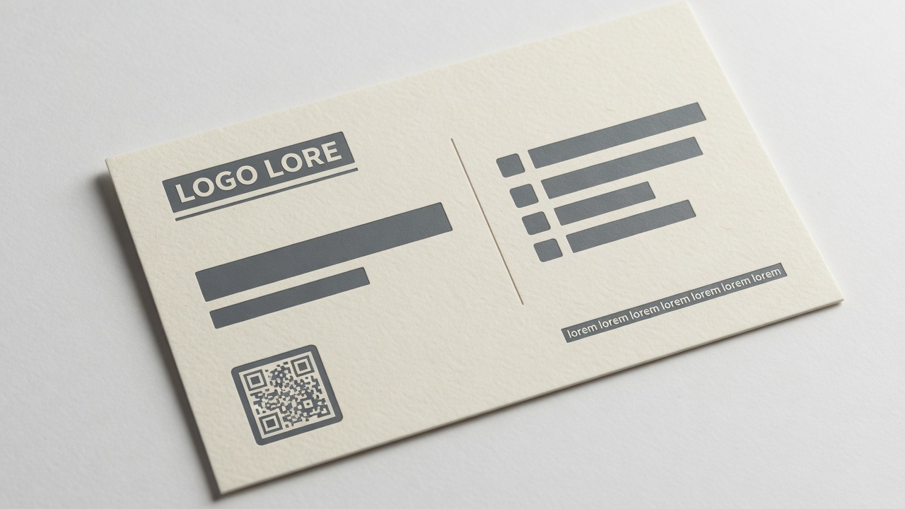
Put your name largest, a one-line title, one phone you answer, one email, and the company. Leave off fax, extra mobiles, credential novels, and URLs you will not maintain. That is what to put on a business card for Irvine professional services: hierarchy on 3.5 × 2 inches, not a resume.
The rest of this page is type size, titles that fit, mobile numbers that are honest, and the lines that should never reach the cutter. I estimate this work at Avanti Printing, 15321 Barranca Pkwy, Irvine, CA 92618. If you want the layout held at actual size instead of zoomed on a laptop, call (949) 387-0787 and come in. Quotes still confirm size, material, quantity, finish, and date. A handsome lockup is not those five facts.
People search what to put on a business card after a designer delivered a beautiful object nobody could read in a plaza, after a title ran two lines into the cell number, or after a partner asked why the card still listed a fax and a second Gmail. Those are content failures. Stock cannot rank your name for you. Film cannot shrink a paragraph. If the words are wrong or too small, you are buying a stack of unread objects.
A ranking, not a dump: the 3.5 × 2 hierarchy
A North American card trims to 3.5 × 2 inches. That is not a flyer, not a letterhead, and not a website footer. You get one glance. The other person is standing, often outdoors, often holding a drink or a phone. Rank the lines for that glance. Do not rank them for a PDF at 400% zoom.
Use this as the conversation at the counter. It is a typical professional-services ranking, not a law, and not a personality test.
| Rank | Line | Job in the handshake | Typical type range | Leave it off when |
|---|---|---|---|---|
| 1 | Name as they should address you | Must be readable at arm’s length | 9–12 pt | Never. If the name loses, the card loses. |
| 2 | One title or role | Tells the other person why they kept the card | 7–9 pt | The title is internal jargon, a joke, or longer than the name |
| 3 | One phone you will actually answer | The follow-up path | 7–8 pt | You will not pick up, or you already printed two other numbers |
| 4 | One email | The written follow-up path | 7–8 pt | The domain is retiring, or you listed a personal Gmail next to work mail |
| 5 | Company or practice name | Places you in a firm | 7–10 pt, sometimes above the name if the firm is the product | The company line repeats the logo word-for-word at the same size |
| 6 | One URL or a small code on the back | Sends them somewhere you control | 7–8 pt type, or a modest mark that does not outrank the name | The site is a placeholder, or the mark is bigger than the name |
| 7 | Required license or credential lines | Keeps a regulated card legal | 6–7 pt, still readable | The number is pending. Do not print a blank or a guess. |
| 8 | Address / suite | Only if people need to find the door | 7 pt | The lease is in play, or a URL already does the job |
Everything else is a candidate for the back, for a smaller quantity until you know you need it, or for the wastebasket. A card is a ranking. A dump is a flyer that did not get permission to be a flyer.
If two lines fight, the name wins. If the name and a decorative mark fight, the name still wins. Type size is how you enforce that ranking after the designer falls in love with a monogram.
I print standard business cards in Irvine from files that already made this ranking, and from files that did not. The second group comes back. Hierarchy is cheaper than a reprint.
Get pricing for a readable card layout
Who this content question is for in Irvine and Orange County
This write-up is for the person who has to live with the words on the card, not the person collecting typefaces. Founders in Irvine Company suites, brokers working Spectrum opens and Newport showings, clinic administrators on Barranca and Alton, attorneys and CPAs in the towers, consultants on chamber and BNI calendars, architects and engineers who still write a job number on the back, contractors who keep a pack between Tustin and Santa Ana job sites. You are buying a hand-off object for Orange County professional services. The other person holds it for two seconds.
I split buyers by what the card has to do, because the line list should follow the job:
- Rainmaker cards. Partners, listing agents, clinic directors, principals. The other person needs a name and a direct line. Cell on the card is usually the honest product. A board number they will never reach is not a courtesy. It is a wall.
- Firm cards. Associates, coordinators, intake staff. The firm is the product. Main number, suite, URL. A personal cell on 500 cards for a seat that may turn over is how you print a public number for someone who then leaves for San Diego.
- Regulated cards. California real estate, some medical and dental, some contracting, some legal. License lines are not decoration. They eat real millimeters. Plan them before you fall in love with a giant monogram.
- Write-on cards. Brokers, supers, schedulers. The back may be a notepad. Do not fill the back with a second resume and then get angry that there is no white space for a gate code.
If you are ordering for a whole floor, do not force every seat onto the owner’s line list. Owner cards and staff cards can share a layout grid and split the content. That is a normal two-line conversation. Send the longest name and the longest title with the master. The longest title is the layout. The shortest title is flattery.
Geography matters where it changes the glance. Irvine courtyards are bright. University Center and Spectrum outdoor tables make thin reverse type disappear. Anaheim Convention Center weeks put the card in a badge sleeve and a tote. A 6-point gray email that looked “clean” in a dark Figma file is not a card in those rooms. Tell me which rooms you actually enter.
Type size that survives a handshake
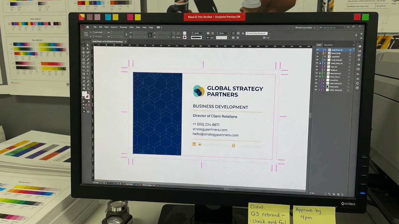
Type size is the enforcement mechanism for hierarchy. If every line is 8 point, you did not design a card. You typeset a paragraph and cut it into 3.5 × 2 inches. If the name is 7 point and a decorative wordmark is 14 point, you designed a logo sticker. I will say that at the counter. It is not a taste argument. It is whether a person at a mixer can read the name without performing a close-up.
Typical industry ranges I actually spec, not a typographic manifesto:
- Name: 9–12 point. Most Irvine professional cards land at 10 or 11. Below 9, the name is competing with the contact block. Above 12, you are usually compensating for a weak hierarchy everywhere else, or you have a short name and a lot of air, which can look considered.
- Title: 7–9 point. One line. If it wraps, the title is too long or the measure is too narrow. Fix the words before you shrink the point size.
- Company line (when it is not the hero): 7–8 point, or a modest wordmark that does not outrank the name.
- Contact block: 7–8 point. Phone, email, URL in one size. Do not set the URL at 6 and the phone at 9 unless you want people to call the URL.
- License and legal lines: 6–7 point, high contrast, not 4-point gray. If a regulator required the line, a person should be able to read it. Tiny legal is how you get a pretty card that is still noncompliant.
- Reverse type (light letters on a dark panel): add about a point and a real weight. Hairline white script on navy is how you pay for a reprint of unreadable names. Ink gain and lamination fill counters. Courtyard sun fills them again with glare.
Point size is not the only variable. Weight, tracking, and contrast do as much work.
Weight. Name in a true semibold or bold. Title in regular or medium. Contact in regular. If the title is heavier than the name, you ranked the job internally and the human last. Faux bold — clicking B on a face that has no bold — looks dirty at card size. Use the real weight.
Tracking. Small caps in a title can take a little letterspacing. Body contact lines should not. Opening the tracking on a 7-point email to “make it elegant” is how the address falls apart. Script faces with tight kerning collide at 8 point and look chewed at 6.
Measure. A contact block set to the full 3.25-inch live width in 7 point is readable. The same block forced into a 1-inch column next to a giant portrait is 5.5 point in disguise. If you want a photo, the type budget shrinks. Say so and cut lines. Do not shrink type to save the photo.
Contrast. Pale gray on cream is a screen habit. It dies in a plaza. The W3C contrast minimum (WCAG 2.2 Success Criterion 1.4.3) is written for screens, not for cards, and I am not pretending a business card is a website. The useful part is the ratio: 4.5:1 for ordinary text, 3:1 for large text. If your 8-point contact line is a 20% gray on white, you are below a bar that was meant to keep letters readable for people with ordinary vision in ordinary light. Print is usually less forgiving than a backlit phone. Aim at near-black type on a light field, or real white on a dark field that is actually dark. Navy at 60% is not a dark field. It is a muddy middle.
How to proof type without lying to yourself:
- Export a PDF. View it at 100% on a monitor, then hold a real 3.5 × 2 rectangle against the screen. If you cannot read the cell number, neither can a person at a Spectrum table.
- Print a cheap laser or inkjet at actual size on office paper. It will not match color or stock. It will tell you whether the name is a name.
- Walk that paper outside. Irvine Company glass and noon sun are the real lighting designer for half the cards I print.
- Hand it to someone who did not design it. Ask them to read the phone number aloud at arm’s length. Do not coach.
- If you plan rounded corners, print the proof with the radius marked. Corners eat type that was “almost fine” on a square card.
Script, ultra-thin sans, and 4-point stacked social handles are the usual casualties. If the brand is a script wordmark, keep the script in the mark and set the person’s name in a readable sans or serif. A name that is also script, at 9 point, on a dark panel, is a puzzle. Puzzles do not get called.
Name, company, and the logo problem
The name on the card is the name they should use when they email you tomorrow. Not the legal entity string unless you are the entity. Not a nickname you do not use in the room. Not “J. MICHAEL” if everyone calls you Mike and your email is mike@. Pick one and live with it. Inconsistency between the card, the email display name, and the way you introduce yourself is how follow-up mail sits in a spam guess.
Company versus person is a ranking, not a compromise at the same size.
- Person-first. Consultants, brokers, most attorneys who rainmake, clinic directors who are the appointment. Name largest. Company smaller, or a modest mark. This is the default Irvine professional card.
- Firm-first. Intake, reception, “Leasing Office,” a restaurant reservations card, a contractor’s company card that survives staffing. Company largest. Person optional. Sometimes there is no person, and that is the point.
- Equal-weight lockups. Name at 11, company at 11, mark at 11. Nobody wins. The card looks busy and still says nothing first. Pick a winner.
Logos fail in two directions. Too small, and you printed a speck that was expensive to draw. Too large, and the name becomes a caption. A mark that is 0.35 inch tall is often enough on a 2-inch card. A mark that is 0.9 inch tall is a poster. If the brand committee wants the mark large, take lines off the card until the name still fits at 9 point or better. Do not keep all the lines and shrink the human.
Repeating the company name in type next to a wordmark that already says the same words is a common Orange County file. The wordmark is the name. Pick type or pick the mark. If the mark is a monogram that nobody can decode, then yes, set the company in type. If the mark already says “Harbor & Pike LLP,” do not also set Harbor & Pike LLP at 8 point under it unless a regulator made you.
Headshots eat hierarchy. Some listing teams want a face. Talent and some medical practices want a face. A 1-inch portrait on a 2-inch card leaves a 2.5 × 2 live area if you are lucky, and less once margins are honest. That is a different card, not a standard card with a photo glued on. Budget the type again. If the face is the product, say so. If the face is a habit from a template, delete it and give the name back its points.
If the lockup is still a fight, that is a design job. Custom business card design in Irvine exists so you are not using a thousand-card order as the argument between a mark and a name. We will set the name first and put the mark where it fits. That sentence saves reprints.
Titles that fit and titles that lie
A title on a card is a one-line answer to “what do you do for me.” It is not a LinkedIn headline, not an org-chart path, and not a hope. If it wraps, it is too long. If it needs a second line of explanation, it is two titles. Print one.
What works, for Irvine professional services, as a typical pattern rather than a rule:
- Attorney: Partner, Associate, Of Counsel, or a short practice label if the firm is already in the lockup — “Partner, Tax” not “Partner, Chair of the Cross-Border Tax and Estate Planning Practice Group.”
- CPA / advisor: Partner, Principal, Manager, or “CPA” after the name if that is the product and the title is noise.
- Medical / dental: the degree line people look for — “MD,” “DDS,” “DPT” — plus a short role if needed, “Medical Director,” not a fellowship list.
- Broker / agent: the role the public understands, plus the required license apparatus. “Realtor” is a membership word, not a license. Do not treat them as the same line.
- Consultant / founder: “Founder” is fine if you founded it. “Principal” is fine. “Chief Visionary Ninja” is a conference joke that looks worse in 8 point than it sounded in a Slack channel.
- Architecture / engineering: “AIA,” “PE,” “Principal” as the lines that matter. Skip “Senior Associate / Project Architect / Studio Lead” unless one of those is the only true line.
Credentials after the name versus a title line: pick a home. “Jane Gomez, CPA” plus a title “Senior Tax Manager” is allowed if both are short. “Jane Gomez, CPA, CFP, PFS, MST” plus “Director of Complex Tax, Trusts, and Family Office Services” is how the cell number becomes 6 point. Stack the letters that change the appointment. Park the rest on a website.
Internal grades do not travel. “Associate II,” “Staff 3,” “AE,” “BDR,” “CSM” are company dialect. The other person at a chamber breakfast does not work at your company. Translate. “Account Executive” is already a stretch. “Customer Success Manager” may be honest and still need a second of thought. If you need a second of thought, the title is not doing handshake work. Use a plain role: “Sales,” “Advisor,” “Project Manager.”
Founder titles have a half-life. “Founder & CEO & Head of Growth” is three jobs and a future reprint. If the LLC paperwork still says Member and you are calling yourself CEO, that is your business. It is also a line that will change when you hire a real chief of something. Keep the count short until the officer titles freeze. Quantity is a different page. Content still has an expiration date. Do not print a title you are already embarrassed to say out loud.
Titles that lie in a quieter way:
- A coordinator card that says “Vice President” because the template had a long line and someone filled it.
- A salesperson card that says “Partner” because it photographs well. Partners at law and accounting firms notice. So do clients who later meet the actual partners.
- A medical card that implies a specialty you are not boarded in. I am not your compliance officer. I will still ask you to read the line as if a patient will.
- A real estate card that omits the responsible broker identity because the agent wanted to look independent. That is not a layout preference. See the license section below.
Longest-title test: before you export twenty names, drop the longest title into the template. “Vice President of Client Partnerships” is a real string. If it collides with the phone, the template is wrong. Do not solve it by setting that one person at 6 point. Solve it by shortening the title vocabulary for the whole office, or by giving the title more measure. Variable names are still one hierarchy.
Mobile numbers, office lines, and what to print
The phone on the card is a promise. You will answer it, or someone at that number will route the caller to you on purpose. A number you silence, a board that dumps to a generic mailbox, or a Google Voice you check twice a week is not a professional service. It is a dead end with ink on it.
The default for most rainmakers in this county is one mobile. Direct. Labeled only if you also printed a second number. Unlabeled if it is the only number — people will call it. That is the point.
When an office line is the honest number:
- Clinics, dental practices, and law-firm intake, where a scheduler should catch the call.
- Property-management and leasing offices.
- Restaurants and hospitality, where the reservation line is the product.
- Any seat that turns over faster than a box of cards. Do not put a new coordinator’s personal cell on 250 cards in week two.
When a mobile is the honest number:
- Brokers and listing agents who live in the car between Irvine, Tustin, and Newport.
- Principals who want the work and will pick up.
- Consultants whose office is a laptop and a Spectrum coffee.
- Contractors and supers who will not be at a desk.
Two numbers are a tax. Each extra line costs points you could have given the name. If you need office and mobile, label them in one character if you can: “O” and “C,” or “Office” and “Direct,” not “Main Office Line” and “Personal Cell (Preferred).” Preferred is a paragraph. Put the preferred number first and larger if they must differ. Better: print one.
What I push back on, from the Barranca counter:
- Fax. Leave it off. If a bank still demands a fax, they will find it on the letterhead or the portal. A card is not a letterhead.
- A second mobile “for WhatsApp.” One number. If you use WhatsApp on that mobile, they will find it.
- A personal cell plus a work cell plus a desk extension. You are not a switchboard. You are a person handing a 3.5 × 2 inch object.
- An old landline you forward “just in case.” Just in case is how a prospect leaves a message in a box you do not open. Print the number you open.
- A number formatted three ways. (949) 387-0787 on the front, 949.387.0787 on the back, +1 949 387 0787 under a code. Pick one local format and repeat it. For Orange County, (949) 555-0123 or 949-555-0123 is enough. Do not print +1 unless your work is actually international and the rest of the card already knows that.
Privacy is a content choice, not a feeling you have after the box arrives. A cell on a card is a public number. It will be typed into other people’s phones, photographed, and sometimes dumped into a spreadsheet. If you are not willing to own that, print the office line. Do not print the cell and then ask me to “make it smaller so it is less public.” Smaller is not private. Smaller is unread.
Extensions belong on office lines, and only if a human or a short tree uses them. “x4827” after a main number is useful in a firm. It is useless on a mobile. Do not invent an extension culture on a card to look corporate.
Texting: if you want people to text the mobile, the number is enough. “Call or text” is a spare line. Use it only when your office culture actually hates voice calls and you need to say so. Most Irvine professional services still answer the phone. Do not outsource that sentence to a card.
Proof the number like a grown-up. Read it aloud. Call it from another phone. Check the area code. 949 and 657 and 714 all live in this county’s head, and a transposed digit is the reprint I see more than a wrong pantone. The reprints at 250 and 500 are often one character. That character was in the file you approved on a parking-lot screen.
What to leave off the card
Leaving a line off is a design decision. It is also how you keep the name at 10 point. The test is simple: will the other person use this line in the next week, or does a regulator require it? If neither, it is a candidate for the website, the email signature, or nowhere.
Leave these off unless you have a specific, named reason to keep them:
- Fax. Dead weight. It trains people to think the rest of the card is equally old.
- A second email. Work or personal, not both. If you are retiring a domain, do not print both “so the transition is clear.” Print the one you want mail in. Forward the other.
- A personal Gmail next to a company domain. It tells the room the company domain is optional. If the company domain is live, use it.
- Home address. A suite is a place of business. A house in a residential HOA is a target. Clients do not need it. Neither do strangers at a mixer.
- Hours of operation. That is a door decal or a website. Hours change. Cards do not.
- Every social network. Icons for platforms you posted on twice are clutter. If a channel is the business — a designer’s Instagram, a chef’s — put one handle, in type, at contact size. A row of 4-point ghosts is not a strategy.
- A tagline that is a mission statement. “Empowering synergy in the Orange County ecosystem” is not information. A short, true descriptor can work: “Commercial leases,” “Pediatric PT,” “S-corp tax.” If it needs a comma and a second clause, it is a brochure line.
- A map. On 3.5 × 2 it is a smudge. Put a suite and a URL, or a code on the back that opens maps. Do not draw the 405.
- “www.” and “https://”. People know what a URL is. firmname.com is enough if the domain is clean. If the URL is a long booking path, shorten it or move it to a code on the back. Do not set a 40-character string at 6 point and call it done.
- Year established, unless that year is the brand and you have the air. “Est. 2019” on a startup card is not heritage. It is a date.
- Quotes, slogans, and “ask me about my [hobby].” The handshake already happened. Do not spend the card on a joke they have to decode later.
- A second language block on the front if it forces both languages into 6 point. Put the second language on the back at a real size, or print a separate short run.
- A full service menu. Four short items on the back can be useful for a contractor or a clinic. Twelve items is a brochure. Brochures are a different quote.
- Clip art, stock icons, and decorative rules that sit on the trim. They are not content. They steal millimeters from content.
- A blank “your name here” on the back because a template had two sides and nobody looked. Open the file. Read both pages.
Leave off lines that are almost true. A suite you do not have yet. A license number you have applied for. A URL that 404s. An email that still belongs to a former coordinator. Almost true is how a card becomes a correction in conversation, which is worse than being out of cards.
Leave off the second copy of a line you already made. If the logo says the company, do not typeset the company again at the same scale. If the URL is in a code on the back, you may still want the URL in type for people who will not scan. That is one extra line with a job. A code, a long URL, a short URL, and three social icons is four ways to say “find me” and no way to read the name.
The leave-off list is how you protect type size. Every kept line is a vote to shrink something else. Vote on purpose.
Optional fields: URLs, codes, and the back of the card
Optional does not mean “print it if the template had a box.” Optional means the line has a job that the name, title, and phone do not already do. A website can be that job. A portal login can be that job. A code that opens a booking page can be that job. None of those jobs outranks the name.
URLs: one. The domain you will still own next year. Short. Typed at 7–8 point, same as the email. If the useful page is a deep link, make a short address or put a code on the back. Do not print a tracking URL from a campaign. Campaigns end. Cards sit in wallets.
A scannable code is one more content field. It is not a personality, not a substitute for a name, and not an excuse to set the human at 7 point so a 1.25-inch square can breathe. If you use one, treat it like a logo: modest, high contrast, with quiet space around it, usually on the back. Typical industry talk, not a lab certificate: most common marks want something in the neighborhood of 0.6–0.8 inch plus a quiet margin to scan reliably in mixed light. A 0.35-inch mark next to a 12-item menu will fail in a dim restaurant even if it looked sharp on a phone. Test it on the actual printed stock, indoors and in a plaza, with more than one camera. A code that does not open is clutter that spent your hierarchy.
What a code is good for, when it behaves:
- A booking or portal page you do not want to typeset as a 40-character string.
- A vCard download if your people actually use that and you have tested it.
- A menu, a lookbook, or a project gallery that cannot fit on 3.5 × 2.
What it is bad for:
- Replacing the phone on a rainmaker card. People still call.
- A front-panel hero that shoves the name into a caption.
- A mark that points at a page you will redesign next month.
- A second code for a second page. One optional object. The rest is a website.
I am not going to turn this into a finishing argument. Codes, URLs, and phone numbers are content. They live in the ranking with titles and type size. If a mark needs more quiet space than your front can give, it goes on the back. If the back is a writing pad, the mark does not belong there either. Then you have your answer: type the short URL and stop.
Other optional fields that earn a place when they are short:
- A license line a statute or regulator wants.
- One handle, in type, if that channel is the business.
- A suite, when people have to find a door in an Irvine tower.
- A second language on the back, at a real size.
- Four service bullets on the back for a trade card.
If you want the object to feel like a nicer piece of board after the words are right, that is a stock and finish conversation on a different line. Premium business cards on quieter stocks and films do not fix a 6-point name. Get the ranking right first.
Request a quote once the line list is set
Front versus back for Irvine professional services
Two sides are not a requirement. A blank back is a writing surface, a cheaper spec, and sometimes the most professional choice in the room. A used back is a second job. Fill it only with a job.
Patterns that work in this county:
Attorneys in the towers. Front: name, short title, firm mark, one phone, one email. Suite if clients come to you; skip it if you always go to them. Back: blank for a department number or a hearing date, or a short URL to the bio. Do not print a practice-area novel. Do not print a Latin motto at 7 point unless that motto already lives on the letterhead and you have air.
CPAs and advisors. Same skeleton. Credentials that change the appointment go after the name or on one title line. Seasonal slogans about tax year go on a mailer, not on a card you will hand in August.
Clinics and dental on Alton and Barranca. Front: provider name, degree, practice name, main number. Patients call the board. Direct cells on provider cards create after-hours mess. Back: portal URL, or a short list — “new patients / records / billing” — not a paragraph. If you add a code, it opens the portal, not the Facebook page.
Real estate. Front: name, cell, brokerage identity, photo only if you already accepted the type tax. License apparatus as required. Back: a short URL or a code to listings, or writing space for a gate code. Do not print six platform icons and a QR-sized mark and a headshot and a slogan. Something will be 5 point. It will be the DRE line, which is the line you cannot afford to lose.
California real estate is not a style choice. Commissioner’s Regulation 2773 requires a licensee to disclose an eight-digit license identification number, and the responsible broker’s name as currently licensed, on solicitation materials intended to be a first point of contact with consumers. The regulation lists business cards first. Read the current text at Cal. Code Regs. tit. 10, § 2773 before you delete a line to save a monogram. I typeset what you give me. I am not your broker’s compliance desk. I will still refuse to pretend a missing eight-digit number is a kerning preference.
Consultants, coaches, and solo practices. Front: name, one descriptor, mobile, email, URL. Back: blank, or one code to a calendar. You do not need a manifesto. You need to be callable.
Architects, interior designers, engineers. Front: name, credential letters that matter, firm. Back: writing space. These cards get job numbers written on them. A full-bleed photo of a stairwell on the back is a nice portfolio and a bad notepad.
Contractors and trades. Company-first is often right. CSLB number if you put licensed numbers on your truck and your bids — be consistent. Cell of the person who will answer at 6:30 a.m. Back: four services, not twenty. “TI / ground-up / service” is enough. A color photo of a bathroom remodel will scuff in a cup holder and still not close a job.
Campus, labs, and UCI-adjacent companies. Titles and emails move. Keep the line list short so a reprint is a name change, not a redesign. Skip the manifesto. Skip the six socials. Name, role, email, URL, maybe a lab or unit name.
4/0 (color front, blank back) is a complete card. 4/4 is a complete card with a second job. Do not print 4/4 because a template opened two pages. Empty pages still cost a second pass of attention, and they still get approved with “Your Name Here” on page 2 if nobody reads them.
Layout, contrast, and files that match the type
Content is not free of the file. A good ranking dies if the live type sits on the trim, if the back is upside down, or if pale gray type meets a soft cream stock and disappears. The print-ready object is still 3.5 × 2 inch trim, 0.125 inch bleed, live matter 0.125 inch inside trim, CMYK, 300 ppi or vectors, fonts outlined or embedded, two pages front then back. That spec does not change because you cut three lines of copy.
Alignment: pick one. Left-align name, title, and contact as a stack. Or center them. Mixing a centered name with a left contact block and a right-aligned URL is how the card looks accidental. Professional services in this county usually want a calm stack. Centered can work on a firm-first card with few lines. Centered plus a long email is a rag that looks like a mistake.
Margins: 0.125 inch is the minimum live. I prefer more air around the name. A card that is “full” at the edges feels cheaper than the board you bought. Crowding is a content problem. If the lines do not fit with honest margins, delete a line. Do not steal the margin.
Rules and boxes: a 1-point box sitting on the trim will never look even after the cut. If you need a rule under the name, keep it short and inside the live area. A rule is not hierarchy. Weight and size are hierarchy. The rule is optional furniture.
Color and type: 100K for small black type. Not a four-color gray, not RGB 0-0-0 left to chance. Reverse type on a rich black panel needs a robust weight. Thin hairline logos reversed out of a photograph will fill. If the brand navy is a panel, proof it on paper; courtyard sun turns a glossy navy into a mirror and your 8-point white email into a rumor.
Rounded corners eat the corner of the safe area. Pull corner-sitting phone numbers in. A cell number in the radius is how a 1/8-inch round takes the last digit. Mention the radius on the quote if you want it. It is not “standard cards.”
Variable names: one master, a spreadsheet, columns for name, title, phone, email, extra line, quantity. The longest name and the longest title must fit. “Christopher” and “Vice President of Client Partnerships” are the real layout. “Amy” and “Associate” are not. If you need us to build that master, say you need design. Do not send twelve Canva links that each shrank type differently to save a title.
Spelling is content. Suite numbers, license digits, emails, URLs. Read them as if you did not typeset them. Click the URL on a phone. Call the number. The most expensive line on a card is the one that is wrong in a small way. People will not tell you. They will just not get through.
Content mistakes that reprint a whole box
These are line-list and type-size reprints I see from the Barranca counter. Not theoretical. Not a customer named in a testimonial.
- Name at 8 point, mark at 14 point. The handshake read a logo. Nobody remembered the person. Fix: name 9–12 point, mark modest.
- Title wrapped under the name and collided with the cell. Internal grade, too long. Fix: one line, plain role, then reset type.
- Three phone numbers, all 7 point, none labeled, one forwarded to a dead mailbox. Fix: one number you answer.
- Fax still on the card because the 2014 file was reused. Fix: open the file. Delete the corpse.
- Pale gray type on cream, unreadable in a plaza. Looked “soft” on a calibrated monitor. Fix: near-black, then walk a proof outside.
- License line at 4 point to save the headshot. Pretty, and a problem if that line was required. Fix: cut the photo or cut a slogan. Do not cut the required number into dust.
- Suite printed during a lease negotiation. Floor changed. Remaining cards named a suite that is now a different company. Fix: URL and main phone until keys exist; short run after.
- Personal Gmail on a company card, then a domain launch two months later. Fix: print the domain you want, or wait. Do not print both.
- A scannable mark larger than the name, pointing at a page that 404ed by the mixer. Fix: modest mark on the back, or a short URL in type, and a live page.
- Back still said “Your Name Here.” Two-page template, one-page attention. Fix: read page 2.
- Every social icon, including a network nobody at the firm can log into. Fix: one handle or none.
- Approved the PDF on a phone in a Barranca parking structure at noon. Contrast and size lied. Fix: actual-size paper, indoors, then a courtyard check.
- Twenty names, each with a different type size so the long titles would fit. The office looked like twenty companies. Fix: one hierarchy, shorter titles.
- No date, no quantity, no finish on the request, then surprise at the box. Quotes confirm size, material, quantity, finish, and date. A line list sits inside that sentence. It does not replace it.
The cheapest reprint is the one you do not do. Deleting a line is free. Shrinking a name to 7 point is how you buy the job twice.
Orange County rooms that change what you print
Not every local color belongs on a card spec. These do, because they change glare, type, which number is honest, and which lines expire.
Courtyard and plaza glare. Irvine Company towers, University Center, Spectrum outdoor tables. Gloss panels and thin reverse type fail here. Silk-quiet surfaces and dark-on-light type survive. If your week is half indoor, half plaza, design the type for the plaza. The conference room will still be able to read a 10-point name.
Chamber breakfasts and BNI tables. You hand a few cards to people who already heard your 30-second. The card has to survive the later look in a car. Name, role, mobile, email. They do not need your manifesto. They need to remember which of twelve accountants you were.
Anaheim Convention Center weeks. Badge sleeves, totes, strangers riffling a stack. Type takes abrasion and bad light. A huge code on the front will get thumbs. A 6-point URL will not be typed on a show floor. Name and a short URL or a modest back mark. Put the show date on the quote so the box exists; do not invent a new identity for three days.
Medical and device corridor on Alton and Barranca. Long credentials, teals that already live on a fascia, lotioned hands, a front-desk bowl. Main number on the public card. Short credential line. Portal on the back. Do not put a fellow’s personal cell in the candy bowl.
Irvine Company suite shuffles. Suite lines die in clusters. If the floor is in play, do not freeze a suite into the hierarchy. Phone and URL survive a move. Reprint the suite when the first rent check clears, at a quantity that matches that truth.
Real estate opens in Irvine, Tustin, Newport, Laguna. Light is brutal. People take a card with sunscreen on their fingers. Cell must be readable. License lines must exist. Headshots are optional and expensive in millimeters. Gate codes go on the back in ink, which means the back needs room.
Campus and startup title weather. UCI-adjacent labs and young companies change email domains and job names. Short line lists. Short quantities. A 12-line card is a 12-line reprint when the domain moves.
Job sites between Tustin, Santa Ana, and Costa Mesa. Dirt, cup holders, one-handed reads. Company name and a cell. CSLB if you use it elsewhere. No pale gray. No giant photo of a finished kitchen that will scuff against a screw.
Hospitality in the Spectrum and Woodbridge. Grease, dim rooms, a reservations number that should be the only number. Person cards for managers who will still be here in six months. House cards for the bowl.
Local does not mean a novelty size. It means your light, your regulator, and your title weather. Tell me those. I will map them onto a line list and a point size.
What to send so the quote names the words
A usable quote request is short. Missing content is how you get a handsome card with last year’s title, or a pause while we guess whether the cell is the number you answer.
- Size. 3.5 × 2 inches, or the custom size in inches.
- Quantity. Per name and total. “250 each, 4 names.” Do not write “a box.”
- Material. Board caliper and coated or uncoated, or “recommend.”
- Finish. Aqueous, film, uncoated, none — as a chemistry, not “nice.”
- Sides. 4/4 or 4/0. If the back is a writing pad, say so.
- The line list, ranked. Name, title, phone, email, company, URL, license lines, suite. Mark which are required. Mark which you will cut if type gets tight.
- Longest name and longest title if this is a batch.
- Date. The date you need them in a hand in Irvine. A mixer, a start date, a show.
- Pickup or ship. Pickup at 15321 Barranca Pkwy, Irvine, CA 92618, or a ship-to with a suite and a phone.
- The file, or a sentence that you need design. PDF with bleed preferred. If the art is a dump of every line you ever used, write that. We will quote a print-ready layout from your text and logo instead of shrinking the name until it fits the dump.
Helpful extras:
- Whether anyone writes on the back.
- Whether a regulator requires a license line. Paste the number. Do not type it from memory in the quote form if you can paste it from the license.
- Whether the cell is public on purpose.
- Whether the suite is real.
- A note if a scannable mark is requested, what it should open, and that it belongs on the back unless the front is already spare.
- CMYK or Pantone for any color that cannot drift.
That list is the job. I can estimate from it. I cannot estimate from “usual cards, make it pop, soon.” Walk-ins Monday–Friday, 8:00 a.m. to 5:00 p.m. Call (949) 387-0787 if you want to hold an actual-size proof of the type. Send the same spec through the quote form if you cannot come in.
For a broader view of what we print besides line-list debates, start at the Business Cards Irvine home page and then send the quote with the five facts: size, material, quantity, finish, and date. Daily-carry work still runs through Irvine business cards we print from a ranked line list; the words and the point sizes are what this page is for.
FAQ
What should I put on a business card?
Name largest, a one-line title, one phone you answer, one email, and the company. Add a short URL if it is live. Add license lines a regulator requires. Put optional marks, service lists, and second languages on the back, or leave the back blank for writing. Leave off fax, extra mobiles, extra emails, mission statements, and anything you will not still stand behind when the box is half full.
What type size should the name and contact lines be?
A typical range, not a law: name 9–12 point, title 7–9, contact block 7–8, required legal 6–7 at high contrast. Reverse type a point larger and heavier. If a line does not fit, cut a line. Do not drop the name below 9 to save a slogan. Proof at actual size, then in courtyard light.
Should my mobile number go on the card?
Yes if you will answer it and you accept that it is public. Print the office line instead for intake seats, clinics, leasing desks, and anyone whose job will change before the box is empty. Do not print two mobiles and a desk line. Do not print a number you forward and ignore. Call the number on the proof.
How long can a title be?
One line at 7–9 point. If it wraps, it is too long. Use the role the other person understands, not an internal grade or a LinkedIn headline. Stack only the credentials that change the appointment. Test the longest title in the office template before you export twenty files.
Do I need my office address and suite?
Only if people need to find the door. Many consultants and rainmakers do fine with a URL and a phone. Irvine Company suites also move. If the lease is in play, do not freeze a suite onto 500 cards. Practices that receive patients and clients in a tower should print the suite once the suite is real.
What about a scannable code or a QR-style mark?
Treat it as one optional field, usually on the back, sized so it can actually scan, with a live destination. It does not replace the name or the phone. It should not be the largest object on the front. If the back is a notepad, skip the mark and typeset a short URL. Test a printed piece, not a screen.
I have a lot of credentials and services. Can I just shrink the type?
No. Shrinking is how the card fails in a plaza. Put the letters that change the appointment on the front. Move the rest to a website, a bio URL, or a short back list of four items. A 5.5-point service menu is not a flexible designer. It is an unread card.
What does Avanti need to quote cards from a line list?
Size, material, quantity, finish, and the date you need them in a hand. Add sides, pickup versus ship, the ranked lines, the longest title, and a PDF or a note that you need design. I will not invent a title or a cell to fill a blank. Call (949) 387-0787 or use the quote form. If the file is a dump, say so; file prep is a line, not a secret press setting.
Rank the lines, set the type, then print
What to put on a business card is a ranking: name, one title, one honest phone, one email, the company, then only the optional fields that still have a job. Type size is how you enforce it. Leave-off is how you protect the name. Mobile numbers are promises. Titles are one line of truth, not a headline. Irvine professional services live in glare, in regulated line lists, and in rooms where two seconds is the whole read. Quotes confirm size, material, quantity, finish, and date — write all five, and write the words in rank order.
If you want this decided at actual size instead of at 400% zoom, come to Avanti Printing, 15321 Barranca Pkwy, Irvine, CA 92618, bring the longest title, and ask to look at the type under indoor light and then toward the glass. Or send the spec, the date, and the line list through the quote form. Call (949) 387-0787. Put the name first. Then we can print the card someone can actually use.