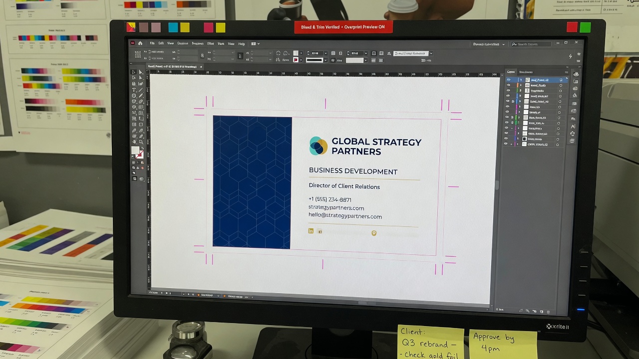
A print-ready business card file is 3.5 × 2 inch trim, 0.125 inch bleed on all sides, CMYK, 300 dpi at actual size, fonts outlined or embedded, and live type 0.125 inch inside trim. Send that PDF and Avanti can quote and print. A Canva RGB export is not that file.
That is the whole spec. The rest of this page is why each number exists, which template habits break it, and what I need on the quote so we are not guessing at the counter. I estimate this work at Avanti Printing, 15321 Barranca Pkwy, Irvine, CA 92618. If you want a PDF checked before you lock quantity, call (949) 387-0787. Quotes still confirm size, material, quantity, finish, and date. A handsome layout is not those five facts.
People search print ready business card files after a cart rejected a PNG, after a box arrived with a white hairline at the edge, or after a navy panel printed purple-brown and a “black” panel printed gray. Stock cannot rescue a 72 dpi logo. Coating cannot invent bleed you never drew. If the file is wrong, you are buying the job twice.
Who this file spec is for in Irvine and Orange County
This write-up is for the person who has to send the file, not the person collecting typefaces for fun. That is usually a founder, an office manager, a broker, a clinic administrator, or a marketing lead who also has to live with the box. You are buying cards for Irvine Company suites, Spectrum offices, UCI-adjacent labs, medical device firms along Alton and Barranca, restaurants in the Spectrum and Woodbridge, and crews that bounce between job sites in Tustin, Santa Ana, and Costa Mesa.
If you already have a designer on staff who exports PDF/X from InDesign, most of this will read as a checklist. Send the checklist anyway. If you built the card in Canva on a laptop at a coffee shop on University Center, this page is the difference between a box you can hand out and a box you hide in a drawer. If an intern “made it pretty” from a website screenshot, we will be rebuilding it. That is billable file work, not a secret press setting.
I split file senders into three jobs, because the file should follow the job:
- You have a brand kit and a layout app. InDesign, Illustrator, or a disciplined Photoshop file. Your job is to hit trim, bleed, color, resolution, and type. We print standard business card printing in Irvine from those PDFs every week. Do not “help” by flattening everything to a 72 dpi PNG for email.
- You have Canva, Word, or PowerPoint. Those tools can start a layout. They do not, by default, hand me a press file. You either learn the export settings below or you pay for custom design and print-ready file preparation. Both are legitimate. Pretending a share link is a PDF is not.
- You have a photo of a card you like. That is a reference, not a file. We can design from a brand and a text list. We cannot magically extract a vector logo from a phone picture taken under a fluorescent kitchen light.
If you are ordering for a whole office, send one master layout and a spreadsheet of names. Do not send twelve slightly different Canva links. The master is the print-ready object. The names are data. Mixing those is how one person gets a missing letter in their email on 500 cards.
Print-ready versus “it looks fine on my laptop”
A screen is RGB, backlit, and bigger than a card. A press is CMYK ink or toner on a 3.5 × 2 inch piece of board. Those are different machines. Use this table as the conversation, not as a personality test.
| Item | Print-ready | Not print-ready |
|---|---|---|
| Trim size | 3.5 × 2 inches (or a stated custom size) | US Letter, A6, a square Instagram post, “whatever Canva had” |
| Bleed | 0.125 inch on every side; background actually extends into it | White sliver, or “the printer can add it” |
| Safe area | Type and logos at least 0.125 inch inside trim | Name sitting on the cut, phone number in the corner radius |
| Color | CMYK, or a PDF/X that is already converted | sRGB, hex from the website, Canva default RGB |
| Images | 300 pixels per inch at 100% size, or true vectors | Website PNG, phone screenshot, LinkedIn headshot blown up |
| Type | Fonts outlined or embedded | Missing fonts, faux bold, a free font you did not send |
| Black | 100K for small type; a stated rich black for large panels | RGB 0-0-0, registration black (100/100/100/100) on a flood |
| File | PDF, two pages (front then back), bleed included | One PNG, a Canva link, a Word doc, a JPEG of the desk |
If even one row on the right is true, the file is not print-ready. I can often fix a single miss. I cannot honestly call a Canva RGB PNG a press file and then be surprised at the edge. Production time is quoted after we see a file we can actually print. A broken file does not start the press clock. It starts a repair conversation.
Build 3.5 × 2 inches. Add 0.125 inch bleed on all four sides. Convert to CMYK. Keep images at 300 ppi at final size. Outline or embed fonts. Keep live matter 0.125 inch inside the trim. Export a two-page PDF. That is a print-ready business card file. Everything else is a draft.
Get pricing for print-ready card files
The 3.5 × 2 rectangle, 0.125 bleed, and the safe area
North American business cards trim to 3.5 inches by 2 inches. That is 89 by 51 millimeters if your designer thinks in metric. It is not the European 85 × 55 millimeter card. It is not a mini flyer. If you want a different finished size, say the inches. Custom is a different quote, not a surprise we discover at the cutter.
Bleed is extra image past the trim. We need it because cutting is a physical act. A stack of sheets moves a hair. A blade has a width. If your navy panel stops at the trim line, some cards will show a white sliver of board. That sliver is not “a bit of character.” It is a file that did not bleed.
The number is 0.125 inch — one-eighth of an inch — on every side. Not 0.0625 unless we agreed to it. Not “a few pixels.” Not only on the long sides. All four sides. That makes the full document 3.75 × 2.25 inches. Backgrounds, photos, and color panels must actually extend into that extra eighth. Drawing a 3.5 × 2 rectangle and then adding an empty white margin labeled “bleed” is not bleed. Bleed is ink in the margin.
How that looks in each app:
- InDesign. Document size 3.5 × 2 inches. Bleed 0.125 inch on all sides. File > Adobe PDF Presets, a press preset, and “Use Document Bleed Settings.” Do not crop the export to trim.
- Illustrator. Artboard 3.5 × 2 with document bleed 0.125, or an artboard of 3.75 × 2.25 with guides at the trim. Extend color to the artboard edge if you used the larger board. Save as PDF with bleeds.
- Photoshop. Canvas 3.75 × 2.25 inches at 300 ppi, CMYK. Drag guides to mark the 0.125 trim. Keep important pixels inside the inner 3.5 × 2. Flatten only after you are sure. Photoshop is the wrong home for a type-heavy card, but it will hold a photo panel if you size it honestly.
- Canva. Custom size 3.5 × 2 inches. When you download PDF Print, turn bleed on. Then look at the download. If the color stops at a neat rectangle and the bleed is empty, you only checked a box. Pull backgrounds to the outer edge.
Safe area is the opposite problem. Trim eats the edge. Rounded corners eat more of the corner than a square cut. Keep names, phones, emails, URLs, logos, and thin rules at least 0.125 inch inside the trim. If you plan rounded corners, pull corner-sitting type closer to the center; the radius will clip a phone number that was “almost fine” on a square card. A keyline border 1 point inside the trim will never look even after the cut. If you need a box, inset it 0.125 inch or more so a 1/64 inch shift does not make one side fat.
Pixel sizes, because someone will Google them:
| Setup | Inches | Pixels at 300 ppi | Pixels at 72 ppi (wrong) |
|---|---|---|---|
| Trim only | 3.5 × 2 | 1050 × 600 | 252 × 144 |
| Trim plus 0.125 bleed | 3.75 × 2.25 | 1125 × 675 | 270 × 162 |
If your PNG is 252 × 144, you have a screen icon, not a card. If your PNG is 1050 × 600 with no bleed, you have a trim file we still have to rebuild for the cutter. If your PNG is 1125 × 675 and RGB, you are closer, and still not done.
Front and back are two pages, same size, same bleed, same orientation. Page 1 is the front. Page 2 is the back. People flip a card on the long edge, like a book. Build the back so that flip reads correctly. If you rotate the back 180 degrees “because it looked better in the template,” half the box will be upside down when someone turns the card in their hand. If there is no back, say 4/0 (color front, blank back). Do not send a second page of random palette squares.
Crop marks are optional if the PDF’s trim box and bleed box are set. If you draw your own marks, put them outside the bleed, not in the live card. Do not include a brown craft-paper mockup, a drop shadow of the card on a table, or a second card “for style.” Those are pictures of cards. I need the flat file.
CMYK is not a filter you apply at the end
Screens mix red, green, and blue light. Presses mix cyan, magenta, yellow, and black ink. The color you picked as a hex on a website is an RGB recipe. It does not exist on the sheet until someone converts it. Conversion is a mapping, not a promise. Bright mint, neon orange, and electric blue are the usual casualties. They dull. That is physics, not a press operator in a bad mood.
Build the card in CMYK if you can. In InDesign and Illustrator, set the document color mode to CMYK at the start. In Photoshop, convert with a profile, do not just “Image > Mode > CMYK” on a flattened screenshot and call it done. The International Color Consortium publishes the profile format that those conversions use. I am not asking you to become a color scientist. I am asking you not to send sRGB and then reject the proof because the Spectrum teal on your phone was hotter.
Canva is an RGB house that will, if you ask, export a “PDF Print.” That export is better than a PNG. It is still a conversion you did not control. Brand colors stored in a Canva kit as hex will shift. If a color is the brand — a hospital teal, a law-firm navy, a restaurant ochre — give me a CMYK build or a Pantone name, not “it is the blue in our Instagram highlight.” We can aim at a swatch. We cannot aim at a memory of a phone.
What to do, practically:
- If you have brand CMYK values, type them in the layout as C, M, Y, K. Do not eyeball a fill from a JPEG letterhead.
- If you have a Pantone, say the number. Digital card runs usually simulate it in CMYK unless we spec a true spot. Simulation is close, not identical. Ask for a proof on the stock if the color is the brand.
- If you only have a hex, tell me that. I will convert it and you will approve a proof. Do not skip the proof because “it is just a card.”
- Do not design a full-bleed neon field and then act shocked when CMYK cannot glow.
Gray is a special trap. RGB gray often carries a color cast after conversion — a pink gray, a blue gray. For a neutral panel, build it in CMYK on purpose. For small body type, use 100K, not a four-color gray. Four-color gray on 8-point type is how you get fuzzy letters when the four plates (or the four digital channels) do not sit on the same 0.001 inch.
A related Canva RGB mistake: placing a logo PNG that was saved with a white box, or with a “transparent” edge that is actually pale RGB gray. On a screen, it disappears. On coated stock next to a tinted panel, you see a ghost rectangle. Send a vector logo, or a PNG that was actually knocked out, and look at it on a colored ground before you export.
I will proof color against the file, not against your monitor. Irvine office glass and parking-lot sun make phone screens lie. If color is contractual, we look at a printed proof under indoor light, not in a courtyard at noon.
300 dpi means 300 dpi at the size of the card
Dpi and ppi get used as cousins in this trade. What I mean is: a raster image should carry about 300 pixels for every inch it occupies on the card. A logo that is 0.75 inch wide needs roughly 225 pixels of width, and I would rather it be a vector so pixels are beside the point. A photo that bleeds across 3.75 inches needs roughly 1125 pixels of width. That is not a lot of pixels. It is also more than a favicon.
Common failures:
- Website logos. A header PNG at 180 × 40 pixels, placed “big enough to read.” It will staircase. Get the SVG, EPS, AI, or a PDF of the mark from whoever drew it.
- Phone photos of existing cards. You are copying a copy, with glare and perspective. That is a reference. Retype the text. Relink the logo.
- LinkedIn and website headshots. Fine as a small thumbnail if the file is already 300 ppi at that thumbnail size. Not fine as a full-bleed portrait.
- Canva stock that looked sharp on a 13-inch laptop. Zoom to 100% at actual inches, not “fit to screen.” If you see mush, I will see mush.
- Illustrator raster effects at 72 ppi. Drop shadows, glows, and Gaussian blurs rasterize at the document’s raster-effects setting. Set it to 300 ppi before you start decorating. If you already built the glow at 72, you own a 72 dpi halo.
- Photoshop files at 72 ppi, then “resized” to 300 without adding information. You scaled a number in a dialog. You did not invent detail.
Vectors — type converted to outlines, logos as paths, rules, shapes — do not have dpi. They are the right tool for a 3.5 × 2 inch object. Use raster for photographs and for textures that are truly pixels. Do not rasterize the whole card “so it cannot move.” That is how a clean name becomes a soft name.
Email compresses. Messaging apps compress more. If you WhatsApp me a layout, I received a layout that went through a sausage grinder. Upload a PDF, or hand me a drive at 15321 Barranca Pkwy. Do not screenshot the PDF and send the screenshot.
Line art is pickier than photos. A thin script monogram scanned at 150 ppi will break. Either redraw it or scan at a higher resolution than you think you need, then size it down. I would rather you send a 600 ppi 1-inch mark than a 72 ppi 3-inch mark.
Outline the fonts or embed them — do not hope
The press computer does not have your Creative Cloud library, your Canva Pro fonts, or that free display face you downloaded at 11 p.m. If the font is not in the file, the RIP substitutes. Substitution is how a refined name becomes Arial, or how a kerned word collides. For a business card, outline or embed. Do not assume.
Outlining converts type to vector shapes. In Illustrator: Type > Create Outlines. Keep a live-type master for yourself so you can still edit next quarter. Send us the outlined PDF. In InDesign, you can outline, or you can export a press PDF that embeds the fonts. Embedding is cleaner if you might need a last-minute name fix. Outlining is safer if the font license is a mess or the face is a display font that embeds poorly.
Canva will subset fonts in a PDF Print export if the face is available to Canva. That often works. It fails when you used a font Canva cannot embed, when you faux-bolded by clicking B on a face that has no bold, or when you converted a text box to an uneditable effect. Faux italic and faux bold are especially ugly at card size. Use the real weight.
Packaging habits that still fail:
- Sending the InDesign file without the Fonts folder.
- Sending a PDF that was exported with “Smallest File Size,” which subsets badly and downsamples images to screen resolution.
- Sending outlines that were outlined at the wrong step, so a name still sits in a live text box on page 2.
- Using a system font you do not own on the machine that made the PDF, then opening the same file on a laptop that substitutes silently before export.
Small type on a card is not a font museum. Name 9–11 point, title 7–8 point, contact block 7–8 point is a typical industry range, not a law. Reverse type (white on a dark panel) needs to be a hair larger and a real bold, because ink gain and lamination fill the counters. Script faces in 6 point are decoration, not information. If a cell number is the reason the card exists, it has to survive a glance in a dim restaurant in the Spectrum. Outline it after you can read it.
Do not convert the logo type to a JPEG “so the font is safe.” That is the opposite of safe. Keep logo type as vectors. Outline it if you must. Do not photograph it.
Rich black, 100K, and why a panel looks gray
One hundred percent black (C0 M0 Y0 K100) is the right black for small type, fine rules, and most logos that were drawn as black. It stays sharp. It does not create a color halo if the other channels shift. On a large panel, 100K looks charcoal, especially on coated stock under Irvine office light. You are looking through a single ink at paper. That is why people say “the black is gray.”
Rich black adds cyan, magenta, and yellow under the black so the panel densifies. A typical coated formula in this shop conversation is C60 M40 Y40 K100. Some files use C40 M30 Y30 K100. Some use C30 M30 Y30 K100. Those are recipes, not a moral ranking. Pick one, use it on the big fields, and tell me if the panel is a brand color rather than “black.” I will not invent a recipe on press to match a memory of a website hero.
What you should not do:
- Registration black (C100 M100 Y100 K100) as a flood. That is 400% ink. It can dry slowly, mark, crack at a score, and still not look “blacker” in a useful way. It is for registration marks, not for a 3.5 × 2 panel.
- Rich black on 8-point type. The extra colors make small letters chubby and, if they drift, chromatic. Body type stays 100K.
- RGB black (0,0,0) left in the file. Conversion may give you a four-color black you did not specify, or a weak black, depending on the profile. Build it in CMYK.
- Mixing two blacks on one card without looking. A 100K logo on a 60-40-40-100 panel can look like the logo is a different object, which is sometimes what you want (a crisp mark on a dense field) and sometimes looks like a mistake. Proof it.
White type on a rich black panel is a knockout: the panel inks stay out of the letter shapes. Hairline reverse type fills. Keep reverse type at a robust weight. Thin script reversed out of a photo is how you pay for a reprint of 1,000 unreadable names.
Overprint is the cousin of this conversation. Black type on a colored field should usually overprint so you do not get a white hairline if registration moves. White type must knock out. Canva and many RGB tools do not expose overprint. If your card is a dark field with small black icons, say so; we will check overprint in prepress. If you set white type to overprint, the type disappears. I have seen that file. It is a blank card with a very confident designer.
Total ink on a coated sheet should stay in a sane commercial range — think of 300 percent as a typical ceiling, not a target to chase. A rich black at 60/40/40/100 is 240 percent, which is comfortable. A photo that was never converted and still carries RGB density can explode into ink-heavy mud. Convert, then look at the CMYK totals on the darkest part of the image.
PDF, PNG, Canva links, and what the RIP will actually take
The preferred object is a PDF. One file, two pages, fonts outlined or embedded, images 300 ppi, CMYK, bleed in the file, trim box set if you know how. A PDF/X-1a file is the boring, professional version of that sentence: CMYK and spot only, fonts embedded, no stray RGB. The Library of Congress maintains a clear description of the PDF/X family for prepress exchange. You do not have to certify a standard to get cards printed. You do have to stop sending files that behave like posters for a phone.
What I will take, in practice, for Irvine business cards we print from supplied art:
- PDF (best). Press-quality or PDF/X. Two pages. Bleed on.
- AI or EPS. Fonts outlined, images embedded, CMYK. Say which artboard is front.
- PSD. CMYK, 300 ppi, 3.75 × 2.25 inches, layers only if you need us to edit. Type in Photoshop is already at risk.
- PDF Print from Canva, with bleed. Workable starting point. We still check RGB, resolution, and whether bleed is real. Budget time for a repair if it fails.
What is not a print-ready file:
- PNG or JPEG of the whole card, even at “high quality.”
- A Canva, Figma, or Google Drive share link with no PDF attached. Links expire, permissions fail, and I am not logging into your intern’s account from the plant.
- Microsoft Word, Publisher, PowerPoint, or Google Slides. Those are layout sketches.
- A photo of a card on a desk.
- A logo only, with “you know what a card looks like.” That is a design job. We will quote design.
- The “Smallest File Size” PDF preset. It is for emailing a menu, not for printing a name.
Native files are useful when you want us to fix something. They are not a substitute for a PDF if the native file uses missing links. Package InDesign (File > Package) if you want us in the native. Include fonts you have the right to send, or outline first.
Compression: ZIP or high-quality JPEG inside a PDF is fine for photos. Do not JPEG a logo. Do not downsample to 72 ppi in the export dialog because the file “was too big to email.” A two-page card PDF should not be too big to email unless you embedded a 20-inch photograph at full camera size. Size the photo to the card, then export.
Transparency: drop shadows and glows must flatten at high resolution. PDF/X-1a flattens. PDF/X-4 can keep live transparency; not every digital workflow wants that on a card. If your design depends on a soft shadow off the edge of the card, that shadow will be cut off at trim unless you are printing on a larger sheet for some other product. Cards do not have hovering shadows in the real world. Put the shadow inside the trim or skip it.
Canva and template mistakes that reprint a whole box
Canva is where a large fraction of Irvine first files are born. It is fine for a draft. It becomes expensive when you treat the default export as press-ready. These are the template mistakes I see from the Barranca counter. Not theoretical. Not a named testimonial.
- RGB PDF or PNG, sold to yourself as “print.” Download PDF Print, not PNG, not “standard PDF,” not a JPG. Then still expect a CMYK conversion. If the brand color is sacred, Canva was the wrong origin, or you will approve a proof like an adult.
- 3.5 × 2 with no bleed. The template was trim size. You filled it edge to edge on screen. The cutter showed board. Enable bleed, extend backgrounds, re-export.
- Bleed checkbox on, art not extended. The file is 3.75 × 2.25 with a 3.5 × 2 picture in the middle and a white frame. That is a padded trim file. Pull the fill to the end.
- Letter-size or Instagram-size, then “resize.” Magic resize does not add bleed, does not convert color, and does not fix a 72 dpi photo. Build the card at 3.5 × 2.
- A mockup of a card on a desk as the upload. I cannot cut out a perspective-warped rectangle and call it square. Send the flat design.
- Website-blue fills. Hex #00AAFF on a screen is a bright RGB cyan. In CMYK it is a tired teal. If you need punch, we pick a CMYK recipe and you look at a proof. You do not argue with physics from a hex picker.
- A logo dragged from the company website. Low-res, RGB, sometimes a favicon. Get the brand pack from whoever paid for the identity.
- Text converted to a grainy image by an effect. Neon, glitch, vintage shadow, background remover chewing the edges of letters. At 3.5 inches, every artifact is visible. Use real type, then a simple panel.
- Free-plan fonts that do not embed. The PDF shows a substitute on our machine. Outline is not always available from Canva. We rebuild the type or you upgrade the export until the font is actually in the file.
- Front and back on one page, side by side. That is a designer’s desk layout. I need page 1 and page 2, each 3.5 × 2 plus bleed. I am not guessing where to cut your sandwich.
- The back is a second front. Two identical faces, or a back that still says “Your Name Here.” Open the file. Read it.
- Sharing the Canva link in the quote form and nothing else. Send a PDF. If you cannot export, say you need design and we will quote a print-ready layout from your text and logo.
- Transparent background on a PNG, then surprise at white board. Paper is not transparency. If you wanted a colored sheet, that is a stock choice, not an alpha channel.
- Hairline rules and 4-point type because the template looked “clean” at 400% zoom. Zoom to actual size. Hold a real 3.5 × 2 rectangle against the screen. If you cannot read it, neither can a person at a mixer.
- Photo frames that clip a 72 dpi image. The frame is vector. The photo is not. Replace the photo.
Word and PowerPoint deserve one paragraph. They are RGB, they think in pages, they squash images, and they do not bleed. A Word business-card template with a table of ten cards on a letter sheet is a copy shop ghost. We do not print that sheet as-is on a letter press run and cut the cells. We rebuild a single 3.5 × 2 file. If you send the Word, you are sending content, not a press file.
If this list is your file, you have two honest paths. Fix it with the spec on this page, or hire us to rebuild it. Rebuilding is faster than arguing with a PNG. It is not free. Put “need file prep” on the quote so nobody pretends the art is ready.
What prepress does to your file before anyone cuts a sheet
When a PDF lands, it does not go straight to a cutter. We look at trim and bleed, color space, image resolution, fonts, overprint, rich black, and whether front and back match. If it is clean, we impose many cards on a larger sheet, add our own marks, and move. If it is not clean, we stop. That stop is the part people remember as “printing takes forever.” The press was never the wait. The file was.
Fixes we can sometimes do without a full redesign: add a simple bleed by extending a solid color; convert a straightforward RGB PDF; outline a missing font if you send the face or approve a substitution; knock a 100K name out of a panel; rotate a back that is 180 degrees off. Fixes we will not pretend to do as a courtesy: redraw a staircase logo; invent a brand CMYK; add 0.125 inch of a photograph that does not exist past the trim; turn a 252 × 144 PNG into a sharp card.
Proofs: a PDF proof shows layout, type, and (with a grain of salt) color. A paper proof on the actual stock shows color and finish in the room. If you approve a PDF on a phone in a parking structure on Barranca, you approved a glowing RGB rectangle. Say so if that is the risk you want to take. If the navy is the brand, look at paper.
Imposition is our problem, not yours. Do not send a letter-size sheet with eight cards drawn on it “to help.” Do not add color bars into the live 3.5 × 2. Do not put the company legal name in 4-point type in the bleed “so it gets trimmed off” unless you like gambling. Bleed is not a trash can for content you almost want.
Names and titles: if you have twenty people, one layout plus a list is the file. Variable names still need the same bleed and the same safe area. The longest name has to fit, not the shortest. Test the layout with “Christopher” and a long title before you export 20 PDFs that each break differently.
File mistakes that force a reprint
These are the reprints that started in the file, not in the stock.
- White edge, no bleed. Navy field, white hairline. The stack shifted a hair. Fix: 0.125 inch of actual ink past trim.
- Name trimmed off. Type sat on the cut, or on a corner that was later rounded. Fix: 0.125 inch safe, more at corners if you round.
- Gray “black” panel. 100K flood on coated stock. Fix: a stated rich black on the panel, 100K on the type.
- Fuzzy logo. Website PNG. Fix: vector mark. Do not “sharpen” a 120-pixel GIF.
- Wrong blue, rejected at the mixer. RGB teal from Canva, never proofed on paper. Fix: CMYK values and a proof.
- Missing font, substituted. The name looked like a different company. Fix: outline or embed, then read the proof.
- Back upside down. Template flipped the second page. Fix: build the flip on the long edge and check a paper dummy.
- RGB black type that converted to chubby four-color type. Small letters look dirty. Fix: 100K for text.
- Border that is fat on one side. 1-point box at trim. Fix: inset the box or delete it.
- A PNG emailed through a chat app. Compression ate the type. Fix: a PDF upload, not a screenshot of a PDF.
- Approved the wrong PDF. Version 3 still said the old suite number. Fix: put the version in the file name and read the proof as if you did not design it.
- No date, no quantity, no finish on the request, then surprise at the box. Quotes confirm size, material, quantity, finish, and date. The file sits inside that sentence; it does not replace it.
The cheapest reprint is the one you do not do. A five-minute preflight is cheaper than a thousand cards with the old phone number, and cheaper than a thousand cards with a white edge you will notice in every handshake.
Orange County habits that show up in the file
Not every local color belongs on a card spec. These file habits do.
Phone proofs in parking-lot sun. Irvine Company lots and Spectrum garages are bright. A phone cranks brightness and saturation. You approve a carnival. The card comes out as ink on board. Proof indoors, at something close to actual size.
Website and MLS logos. Real estate teams grab the mark from a listing site because the brand pack is in someone else’s Dropbox. Listing sites serve screen files. Ask for the vector. If the brokerage cannot provide one, we redraw it as a paid file job, or we print the staircase and you live with it.
Medical and dental density. Clinics along Alton want a name, three degrees, a suite, a URL, a portal, two phones, and a tiny map. That is a lot of 3.5 × 2. Hierarchy first. If it does not fit at a readable size, it does not fit. Shrinking to 5.5 point is not a solution. We will say so rather than print a card nobody can use at a reception desk.
UCI-adjacent turnover. Labs and startups reprint names. Keep the master as live type on your side even if you send us outlines. The next hire should not require hunting a 72 dpi PNG of the last card.
Job-site GCs. A photo of a competitor’s card, or a photo of last year’s card in a truck cup holder, is a common “file.” It is a content brief. We typeset from it after you confirm spelling. Glare on a phone photo is not a font.
Intern Canva files from a personal account. When that intern leaves the Spectrum office, the link dies. Export a PDF and store it with the company, not in a personal Canva folder named “finalFINAL2.”
Convention and mixer weeks. Anaheim Convention Center and local chamber tables do not change dpi. They change how many people see a bad edge in one afternoon. File errors scale with the room. They do not become acceptable because the event is close. Put the date on the quote; attach a usable PDF when you send it. Bindery time depends on the job we actually have, and a file in repair is not yet that job.
Heat, wind, and HOA rules are real for other products. For a card file, the local problem is almost always the origin of the art: a screen, a phone, a template, a website. Tell me where the logo came from. It saves a round.
What to send so the quote is real
A usable quote request is short. Missing one of these is how you get a number that does not match the box, or a pause while we reverse-engineer a PNG.
- Size. 3.5 × 2 inches, or the custom size in inches. If you already built bleed, say so (“3.5 × 2 trim, 0.125 bleed”).
- Quantity. The number you will take. If several names, the quantity per name and the total.
- Material. 14pt, 16pt, duplex, coated or uncoated — whatever you want us to price. If you do not know, say “recommend” and we will. Do not write “premium” alone.
- Finish. Aqueous, gloss film, matte film, soft-touch, uncoated, none. Finish is a line on the quote, not a vibe in the PDF.
- Sides. Color both sides (4/4) or front only (4/0).
- Date. The date you need them in a hand in Irvine. A file that needs rebuild sits in front of that date.
- Pickup or ship. Pickup at 15321 Barranca Pkwy, Irvine, CA 92618, or a ship-to address.
- The file, or a sentence that you need design. PDF with bleed preferred. AI, EPS, PSD as noted above. If the art is not ready, write that. We will quote design and file prep instead of pretending.
File extras that save a call:
- Front and back labeled.
- CMYK values for any color that cannot drift.
- A vector logo, even if it is also placed in the layout.
- The longest name and title if this is a batch.
- Whether corners are square or rounded (radius in inches if you know it).
- A note if the back must flip a certain way for a badge holder or a wallet.
That list is the job. I can estimate from it. I cannot estimate from “usual cards, attached screenshot, soon.” Walk-ins Monday–Friday, 8:00 a.m. to 5:00 p.m. Call (949) 387-0787 if you want to look at a paper proof with the file. Send the same spec through the quote form if you cannot come in.
For a broader view of what we print besides file debates, start at the Business Cards Irvine home page and then send the quote with the five facts: size, material, quantity, finish, and date — plus the PDF that matches the size.
FAQ
What makes print ready business card files actually print-ready?
A 3.5 × 2 inch trim, 0.125 inch bleed on all sides with art that extends into it, CMYK color, images at 300 ppi at final size or true vectors, fonts outlined or embedded, live type at least 0.125 inch inside the trim, and a two-page PDF (front then back). If any of those is missing, it is a draft. Drafts can become files. They are not files yet.
Do I still need 0.125 inch bleed if my background is white?
If every side is paper-white and nothing sits near the edge, bleed matters less, and I would still build the document with 0.125 inch bleed so the trim box is unambiguous. If any color, photo, or rule goes to the edge, bleed is required. White templates with a colored header are the usual miss: the header needs bleed even if the rest of the card is open paper.
Can I send a Canva link or a PNG?
You can send them as a starting point. I will not call them print-ready. Export PDF Print with bleed, then still expect a preflight. A PNG is a picture of a card. A link is a permission problem waiting to happen. If you cannot export a proper PDF, say you need design and we will build one.
Why did my black panel look gray, or my navy look purple?
A 100K panel looks charcoal on coated stock; use a stated rich black (a common starting recipe is C60 M40 Y40 K100) for large fields, and keep small type at 100K. Navy and teal that started as RGB will shift in CMYK, sometimes toward purple or mud. That is conversion, not a random press mood. Give CMYK values and approve a proof if the color is the brand.
Should I outline fonts or embed them?
Either, as long as you actually do one. Outline in Illustrator if the file is done and you want zero font risk. Embed via a press PDF from InDesign if you may still change a name. Do not send live type with no fonts. Do not rasterize type to a JPEG to “lock it.” Canva users should export PDF Print and then check that the letters are still sharp, not a photo of letters.
What resolution is 300 dpi on a 3.5 × 2 card?
Trim-only, 1050 × 600 pixels. With 0.125 inch bleed, 1125 × 675 pixels. Vectors ignore that math and are preferred for logos and type. A 252 × 144 PNG is 72 ppi at trim size. Upsampling it in a dialog does not add letterforms. Replace it.
What does Avanti need to quote business cards from a file?
Size, material, quantity, finish, and the date you need them. Add sides, pickup or ship, and the PDF (or a note that you need design). I will not invent a caliper or a date to fill a blank. Call (949) 387-0787 or use the quote form. If the file fails preflight, the quote may include file prep. That is honesty, not an upsell surprise — if you already know Canva RGB is what you have, say so up front.
Can you fix my file, or do I need to start over?
Solid-color bleed, a simple RGB-to-CMYK conversion, and a missing outline when you can send the font are often repairable. A 72 dpi logo, a photo of a card, and a layout with no hierarchy are rebuilds. Rebuilds are a design quote. Send what you have; we will tell you which column you are in before we pretend a press can sharpen a favicon.
Send the file you mean, then print it
Print ready business card files are a size, a bleed, a color space, a resolution, and a font policy. 3.5 × 2, 0.125 inch bleed, CMYK, 300 dpi at actual size, outlined or embedded type, live matter in from the trim. Canva RGB, website PNGs, and share links are drafts. Rich black is for panels. 100K is for text. Quotes confirm size, material, quantity, finish, and date — write all five, and attach the PDF that matches the size.
If you want this decided on a real PDF instead of a screenshot, come to Avanti Printing, 15321 Barranca Pkwy, Irvine, CA 92618, send the file through the quote form, or call (949) 387-0787. Bring the logo as a vector if you have it. Bring the longest name if you have a list. Then we can print the card you thought you had already designed.